Branding / Website Design
ClaimChoice
ClaimChoice asked Atomicdust to update its branding and website, repositioning the company as a leading authority in advancing the health insurance industry.
ClaimChoice asked Atomicdust to update its branding and website, repositioning the company as a leading authority in advancing the health insurance industry.

ClaimChoice offers businesses and brokers new possibilities in health insurance. Through unique plan options, companies can create custom solutions that aren’t tied to one network, saving money and giving flexibility to their employees at the same time.
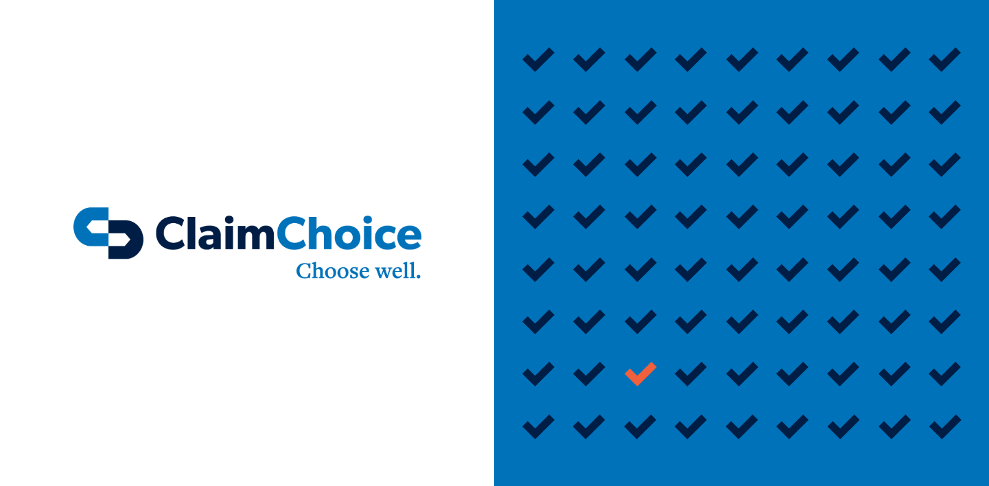

After the initial research phase of our branding program, we translated our findings into a new visual structure and language system.
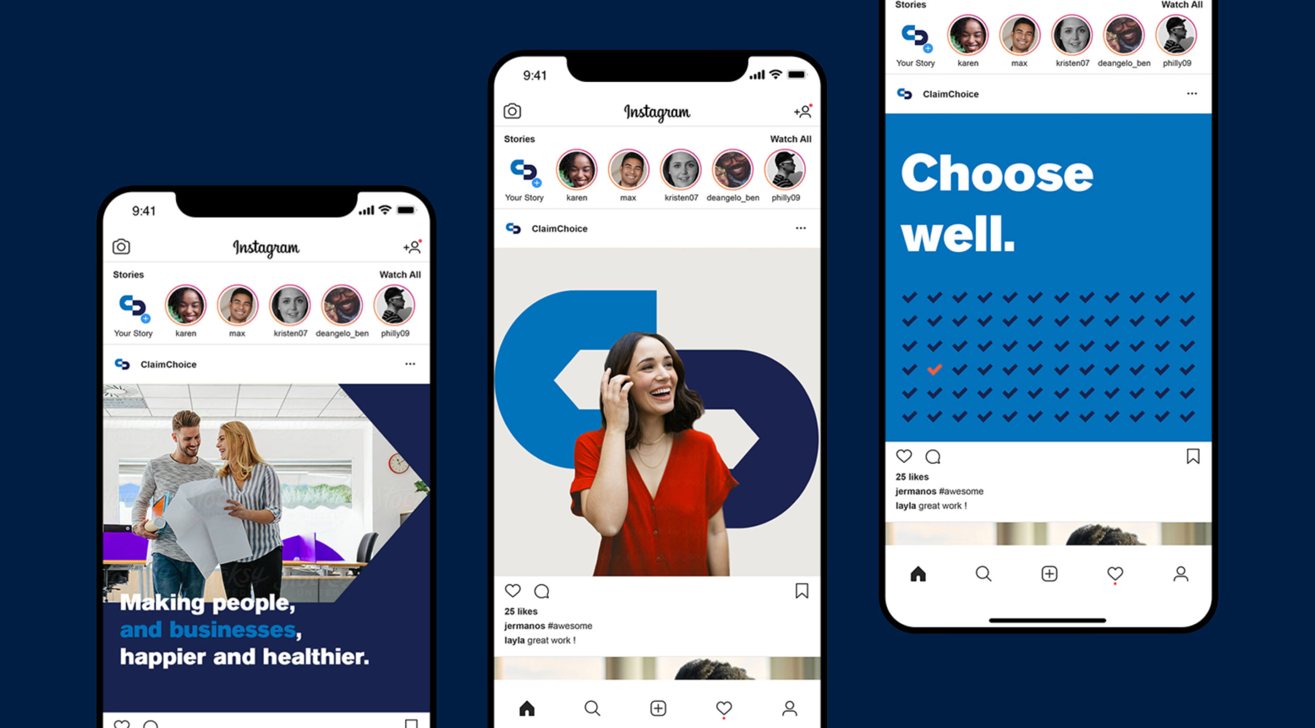
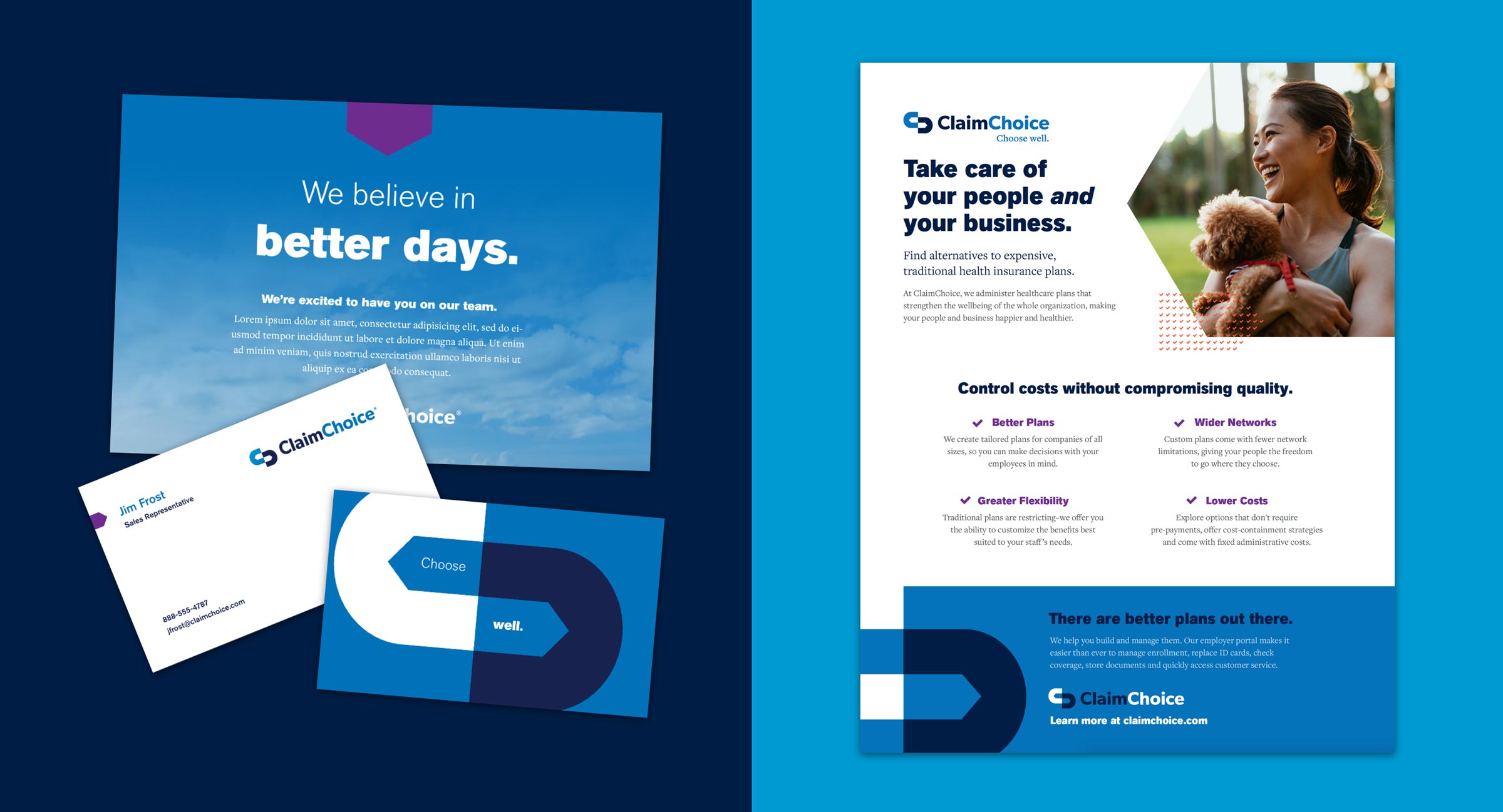
Different shades of blue and checkmark patterns bring trustworthiness to the brand. At first blush, ClaimChoice’s logo looks like a stylized version of the company’s initials, but in the negative space, two guideposts represent its role as a leader for its clients. Brand language is approachable and clear (health insurance doesn’t need to be any more complicated) and the tagline encourages audiences to Choose Well.


With brokers, employers, providers and members all coming to ClaimChoice for answers and guidance, we designed the new site to speak directly to each group. The Choose Well page introduces the brand’s mission while explaining plan options and the benefits of partnering with ClaimChoice. Beyond that, the site is divided by audience, so any visitor can quickly and easily find what they want.
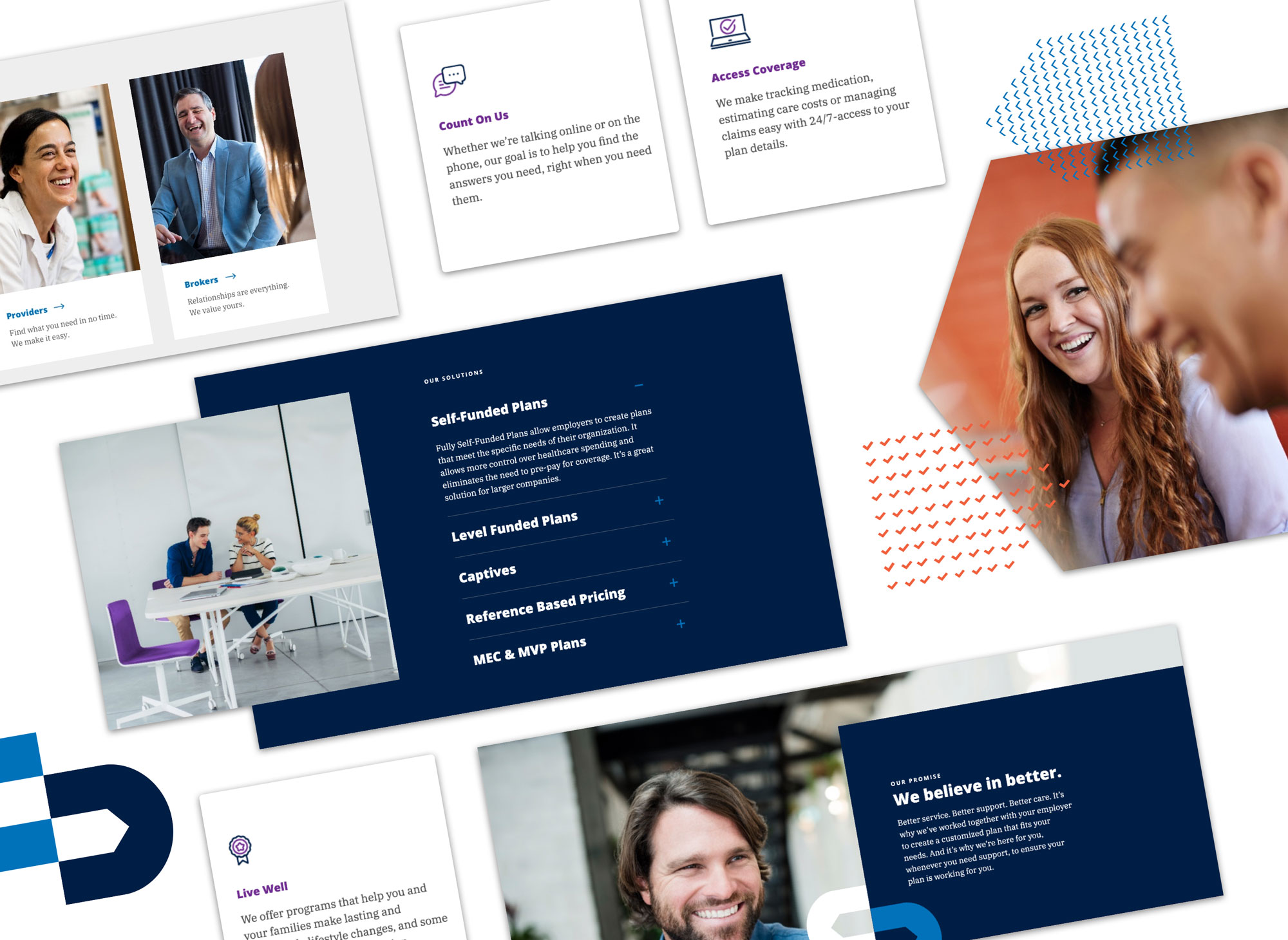
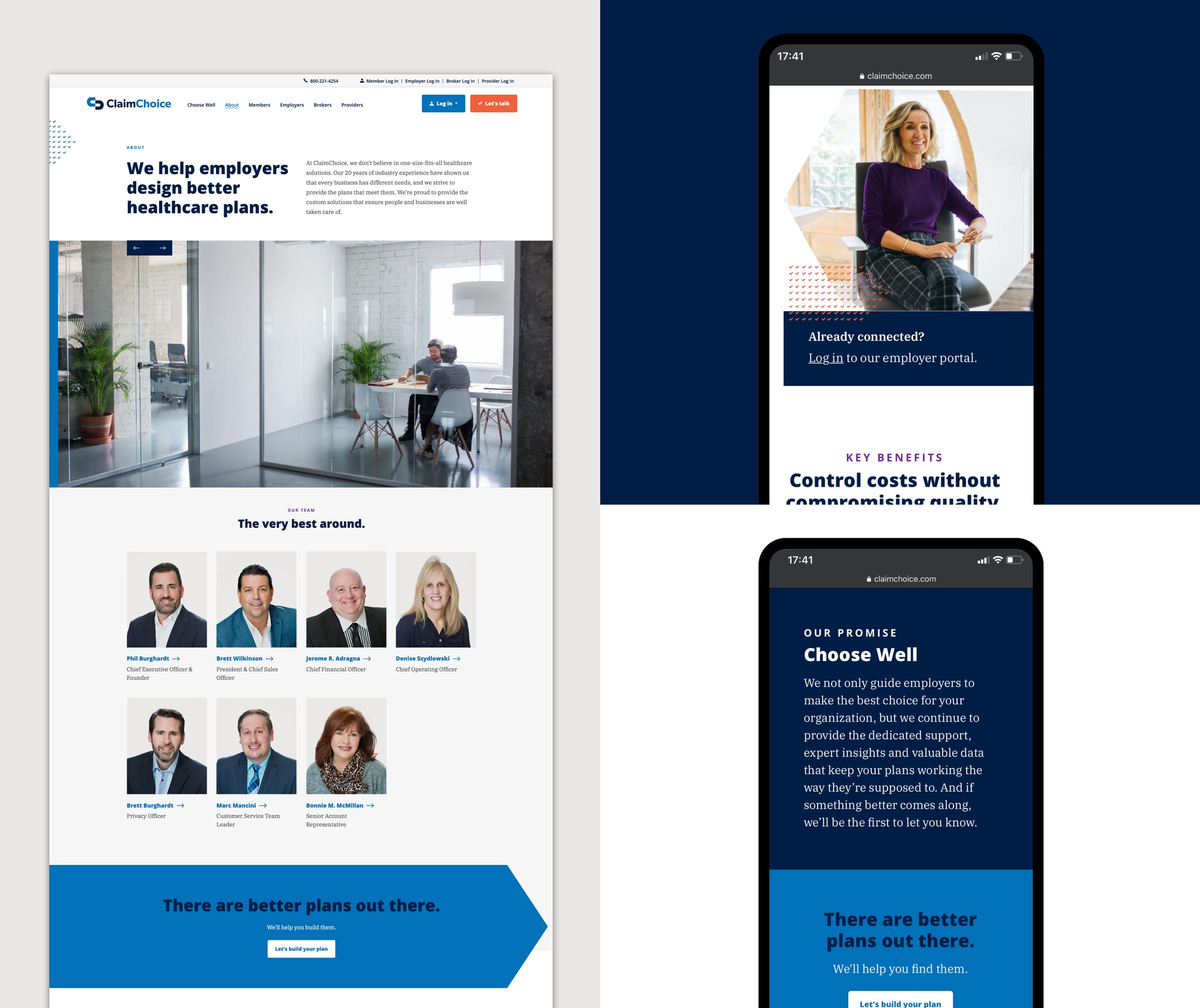
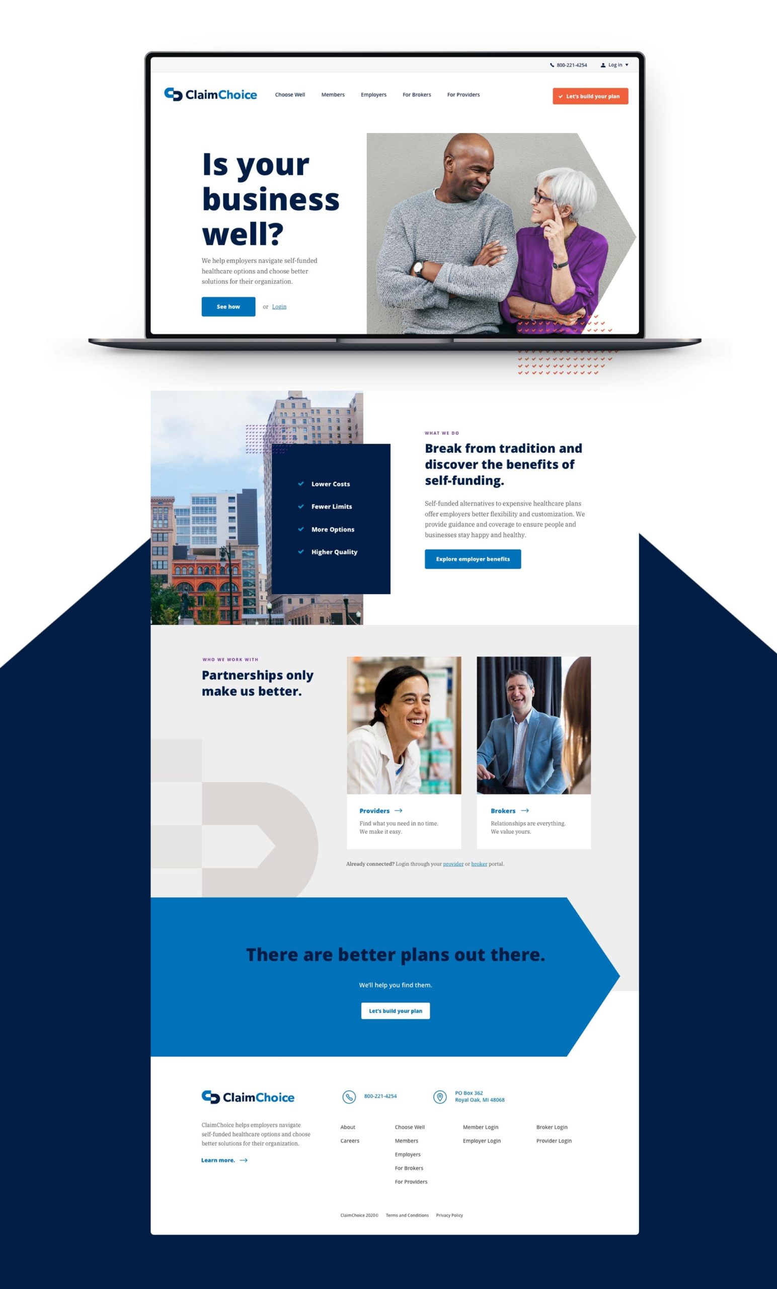
The new branding revitalizes ClaimChoice’s website and marketing materials, giving the company the modern look and feel needed to increase market share and upend the health insurance industry.