Mueller Prost


Mueller Prost, a CPA and business advisory firm, had a difficult time keeping their old website up-to-date. They asked Atomicdust to build a fresh new website design that would modernize the brand and clarify its positioning on the web.

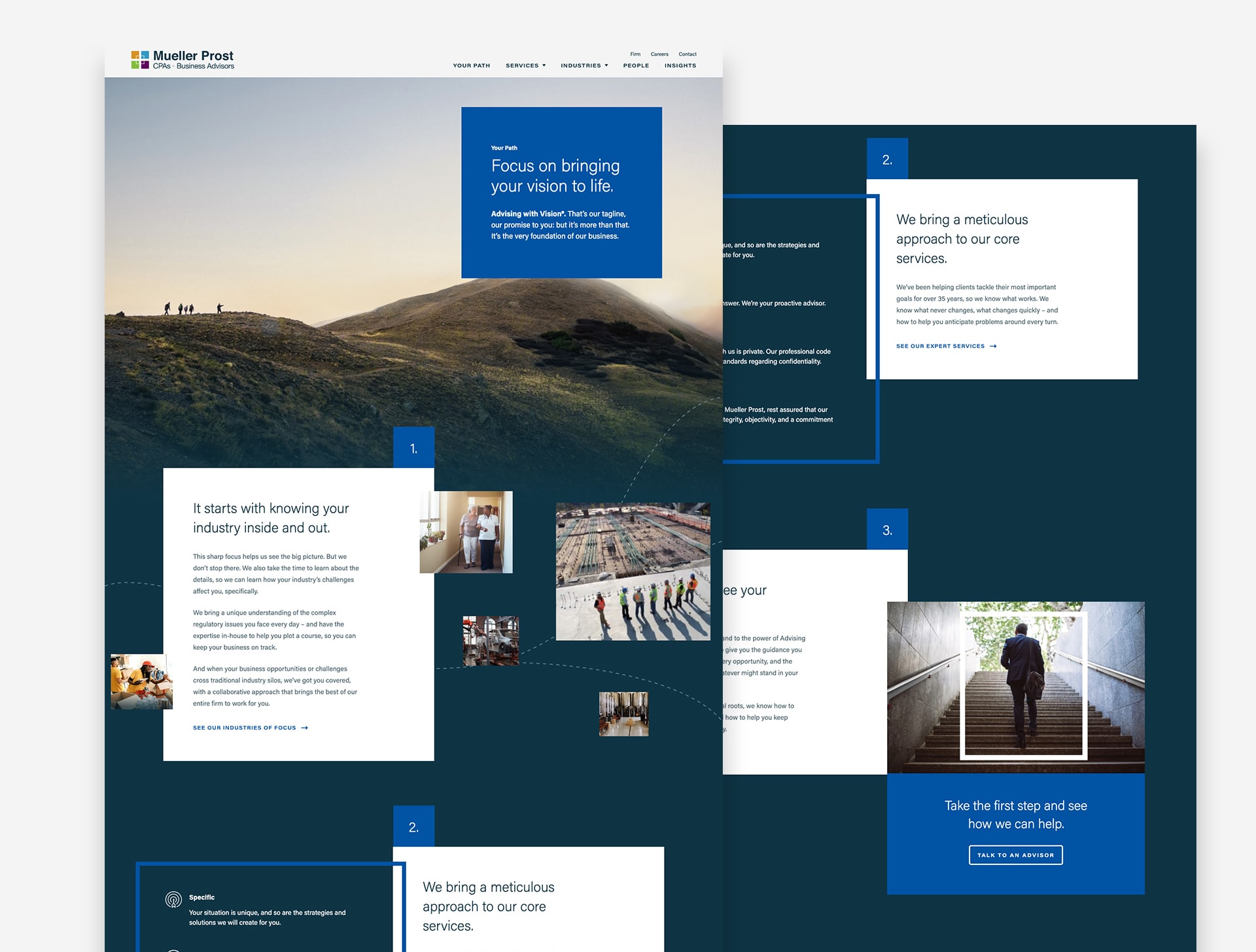
Graphic from the Mueller Prost website design shows a square over a photo of hikers with the words Advising with Vision

Window of opportunity.

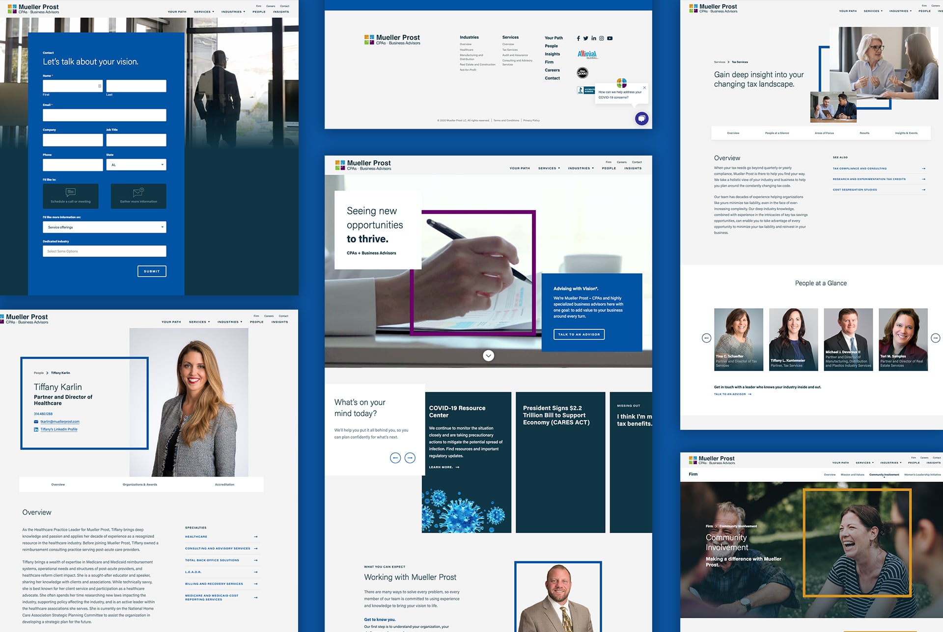
The firm recently had its logo redesigned to match its tagline, Advising with Vision. We took inspiration from that word, vision, and designed modern elements that could be used throughout the site: squares representing windows serve as frames for photos and graphic elements in videos, while icons represent Mueller Prost’s services and client industries.

With five colors, the logo is more detailed than most. Instead of trying to include all of the brand’s colors on each page, we used them as accent colors to offset the deep blue, bright blue and off-white that make up the majority of the designs. Animations throughout the site bring movement and life to the brand in unexpected, yet meaningful, ways.

Atomicdust client Testimonial

Seeing the bigger picture.

Most accounting and consulting firm websites feel virtually interchangeable: they all say the same things to the same people. To help Mueller Prost stand out, we again drew inspiration from the Advising with Vision tagline. As an example, the Your Path page, the first option on the site’s menu, tells the story of the firm’s services through a unique lens: not about Mueller Prost’s vision, but its clients’ vision.

The rest of the site takes the same approach. As we worked with Mueller Prost’s subject matter experts on each page, we sought to answer the question: How does Mueller Prost’s unique perspective benefit clients?

Mockups of Mueller Prost's website design pages

Putting it to work.

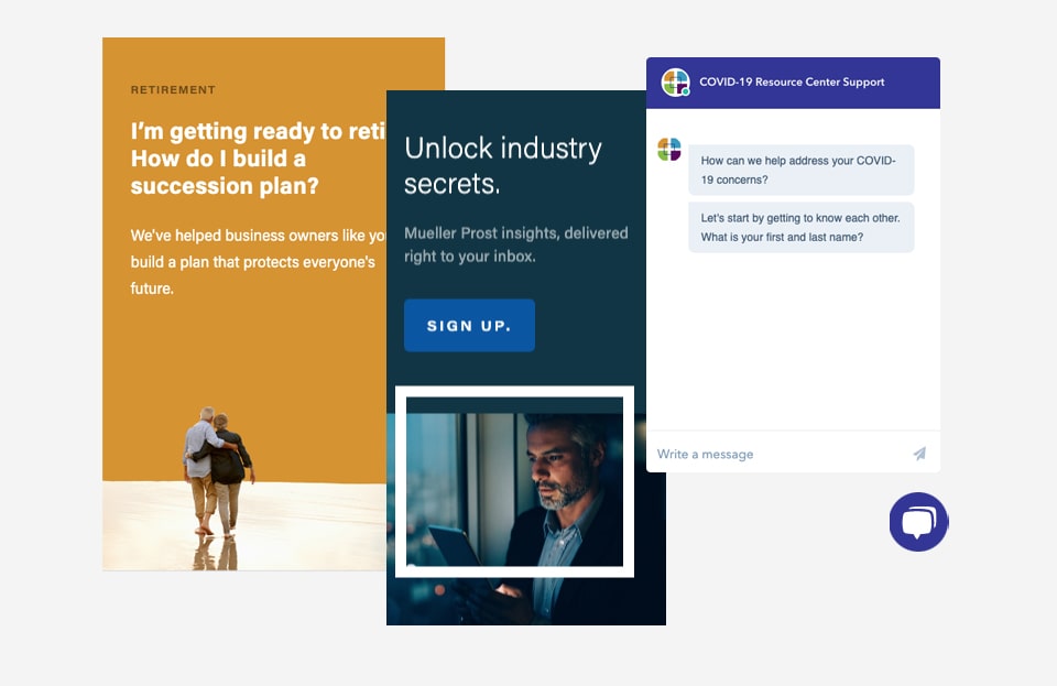
Usability was an important factor in designing the site. We integrated a HubSpot chat function and newsletter sign-ups to help the firm generate leads. The new site is also a key part of the brand’s growing content strategy. They’re publishing more blog posts and white papers than ever, and we’ve made it easy for them to share this content with as many clients and prospects as possible. Elements of the website are modular, so the team at Mueller Prost can easily build new, unique pages that still fit cohesively with the site as a whole. In fact, the team was adding content to the site within hours of launch.

Examples of UX and UI design in Mueller Prost's website, including a chat feature and newsletter signup
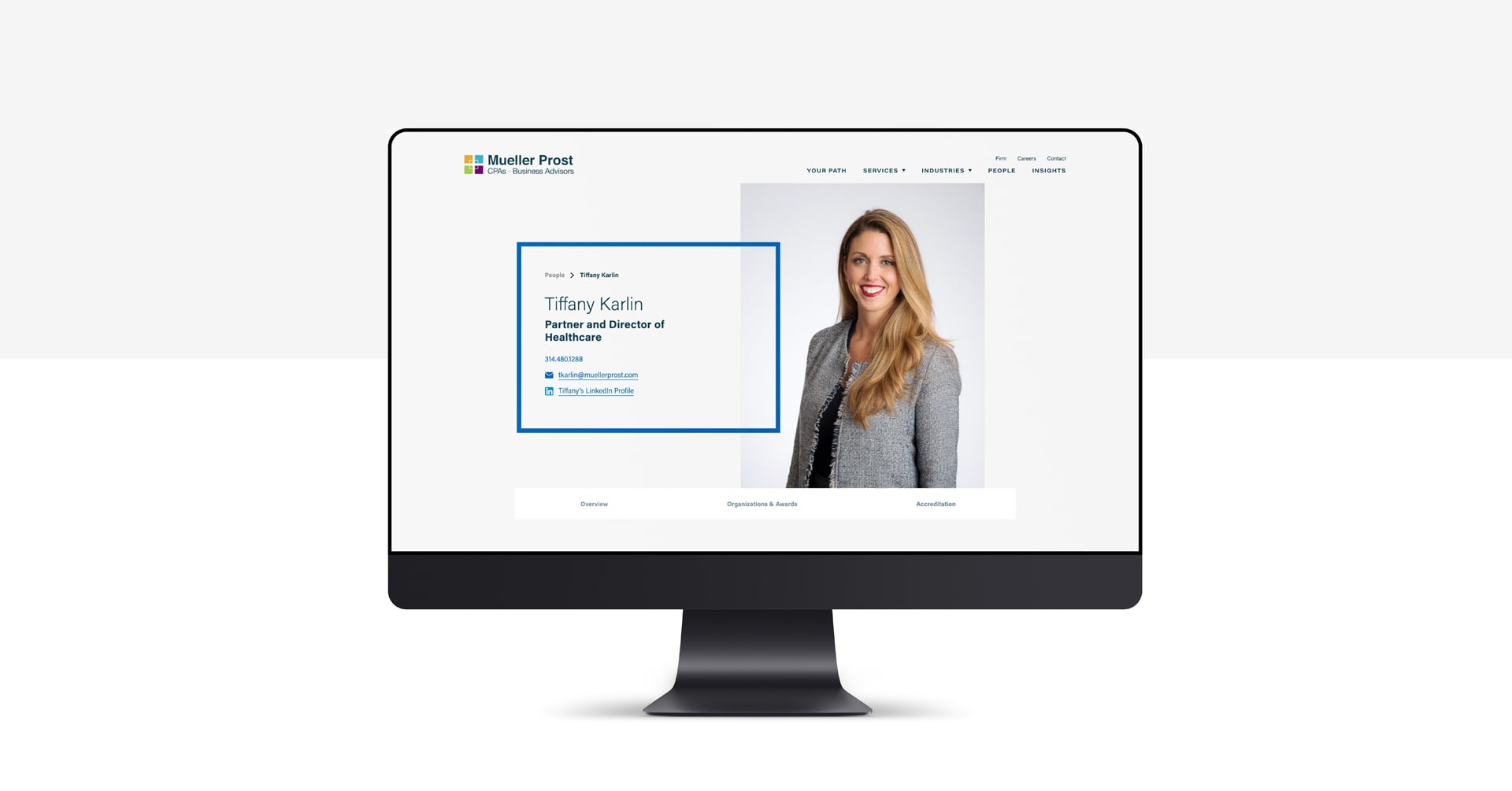
Mueller Prost's website on a desktop computer
Atomicdust client Testimonial

Built for the future.

Recognizing the value of their new website, the team at Mueller Prost has quickly embraced the power of content to share their vision with core audiences. We’re looking forward to helping the brand find even more innovative ways to grow their business.

Examples of pages from Mueller Prost's website