Clean Design and Copy
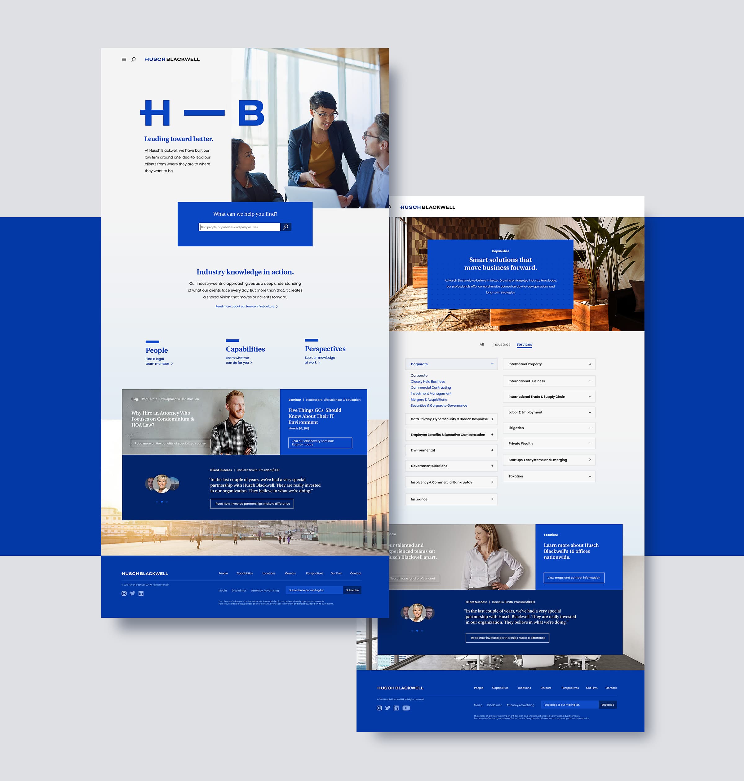
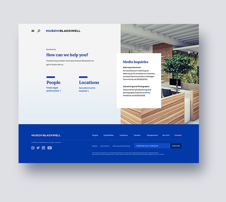
True to the philosophy of leading people to the information they need, the site’s clean design ensures key actions are always on screen, from inviting questions on the homepage (a clever search bar), to reading case studies and testimonials on industry-specific page, to contacting a legal professional when the time is right. Subtle animations make the site feel fluid and alive, without getting in the way of core actions.
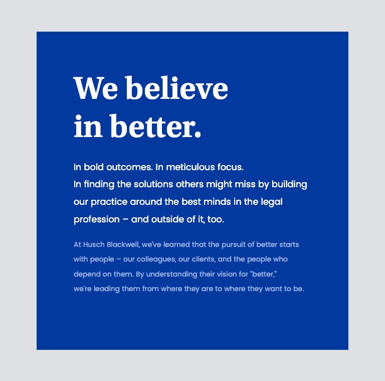
We took a similar, clearer-is-better approach to writing copy for the site, forcing ourselves (and our client) to keep the core brand in mind: this website is about solving clients’ problems, and proving that Husch Blackwell is qualified to do so.
Check out the new Husch Blackwell website, and keep scrolling for a behind-the-scenes look at how this group of 800 lawyers taught us to build a better website.
