Branding Gets Personal With Coastal Business Supplies
What’s the power of a logo against the allure of a cheaper price?
In a commoditized industry, what good is a rebrand? As Atomicdust worked with Coastal Business Supplies to reshape their vision and visuals, we found plenty of answers.
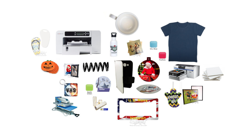
Coastal provides the equipment and materials that people need to create their own personalized merchandise. For nearly 30 years, they’ve sold printers, heat presses, heat-transfer paper, blank mugs, t-shirts, tote bags and more to big businesses, small businesses, “solopreneuers” and stay-at-home parents alike.
The company has been around since 1990, but the competition has never been stiffer.
Because so many competitors sell the same products, most customers tend to pick whichever brand is cheapest – especially if they can’t remember the brand they bought from last.
And that was the problem for Coastal.
Coastal has some major strengths: a more comprehensive selection than competitors, fair pricing, a great reputation within the growing sublimation printing industry, and a strong internal culture that fuels an excellent customer service experience. But customers weren’t connecting with Coastal’s inconsistent, outdated brand, which included two confusing logos, an employee-focused tagline (“To the extent we serve…we succeed!”), and a hard-to-pinpoint brand voice buried beneath loads of product imagery and copy.
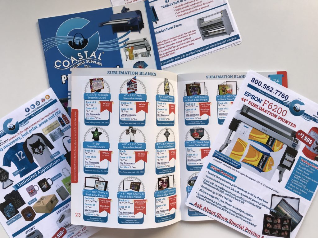
The Gateway Arch in the middle of the logo represented Coastal’s St. Louis headquarters, but hid the fact that the company has operations nationwide.
How could they grow their loyalty in an industry that had been commoditized? After internal and external stakeholder interviews, an extensive customer survey, a competitive audit and a close look at trends and predictions within the personalized merchandise industry, we had some solid recommendations – and a clear creative vision.
Rational vs. Emotional Buying
 Remember the question we asked above? What’s the power of a logo against the allure of a cheaper price? If our goal was to encourage emotional buying (“I always buy from Coastal, my favorite brand”) over “rational” buying (“I’m just going to choose the cheapest product”), then Coastal’s new visual identity couldn’t be a cosmetic exercise. It needed to represent a fresh start, and stand for something more meaningful than a product catalog.
We envisioned Coastal as not just a product supplier, but as a personal guide and educator for personalization businesses owners looking to grow their revenue and reputation. Coastal would still offer fair pricing, fast shipping and convenience, but now those features would be wrapped in a more compelling – and memorable – story.
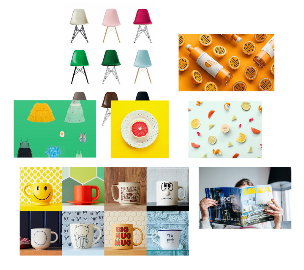
For Coastal’s redesign, we were inspired by product photography that uses bright, vibrant colors. We also loved the way brands like Etsy and IKEA give personality and style to everyday objects.
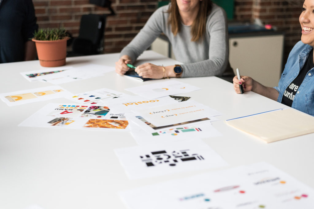
We recommended that the brand expand their collection of online video tutorials, how-to-guides and workshops centered on the needs of these small business owners. We also helped them identify new product and technology opportunities that would enable them – and by extension, their business owner customers – to gain a competitive advantage.
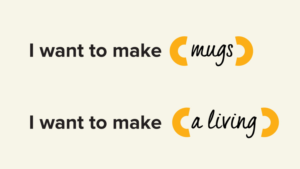
As the new Coastal brand narrative notes: “We think the personalization business should be more personal. Because we know that our customers aren’t just making products, they’re making a living.” In that spirit, we updated the tagline from “To the extent we serve…we succeed!” to the more modern and encouraging “Personalize your profession.”
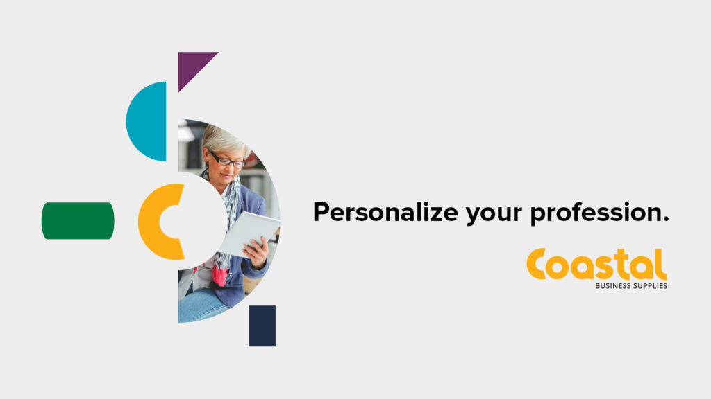
“C” is for Custom Type – and More
Our research showed that the name “Coastal” had brand equity, but many customers couldn’t describe the logo, even though it appeared on almost every piece of Coastal collateral – including shipping boxes.
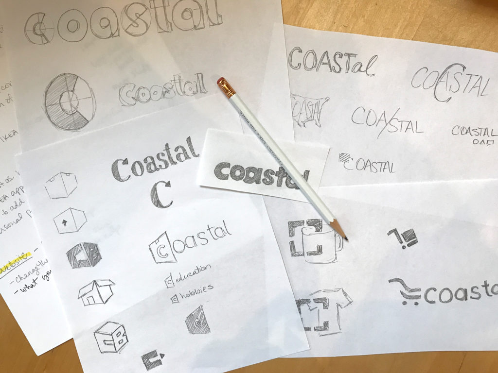
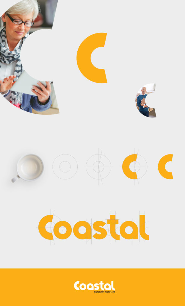
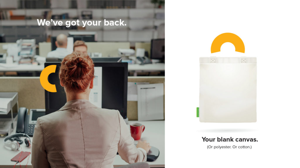
“C” is for Coastal, but as we worked on a new logo and brand mark we realized the letter – and its curved shape – could stand for container, component, customer service, consulting, and any number of brand elements. And a brand that’s all about personalization deserves custom type. The “C” that we crafted is the foundation of every letter in the logo.
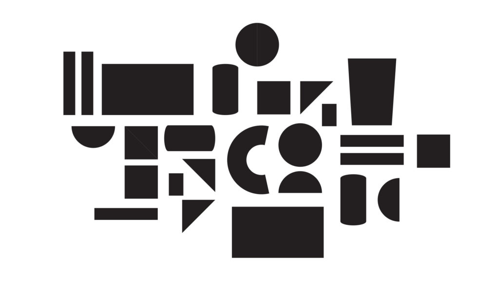
We also developed a unique graphic element: a “confetti” pattern inspired by some of our earliest brand explorations. These patterns represent the breadth of products Coastal provides and the infinite number of creative combinations customers can make.
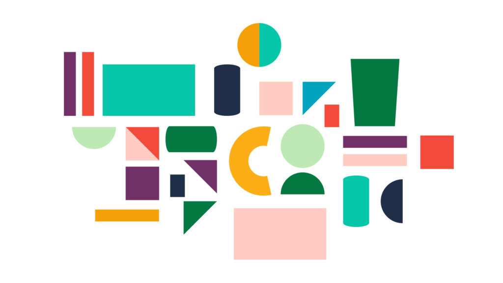
The primary palette consists of a friendly “Coastal Orange,” a calming powder blue, and a light, neutral gray. Secondary colors include warm reds, pinks, teals, and other standout colors with the vibrancy and determination of a small business owner.
We recommended a more natural approach to photography – candid poses, realistic environments – and bid goodbye to cluttered product photography and overplayed visual metaphors.
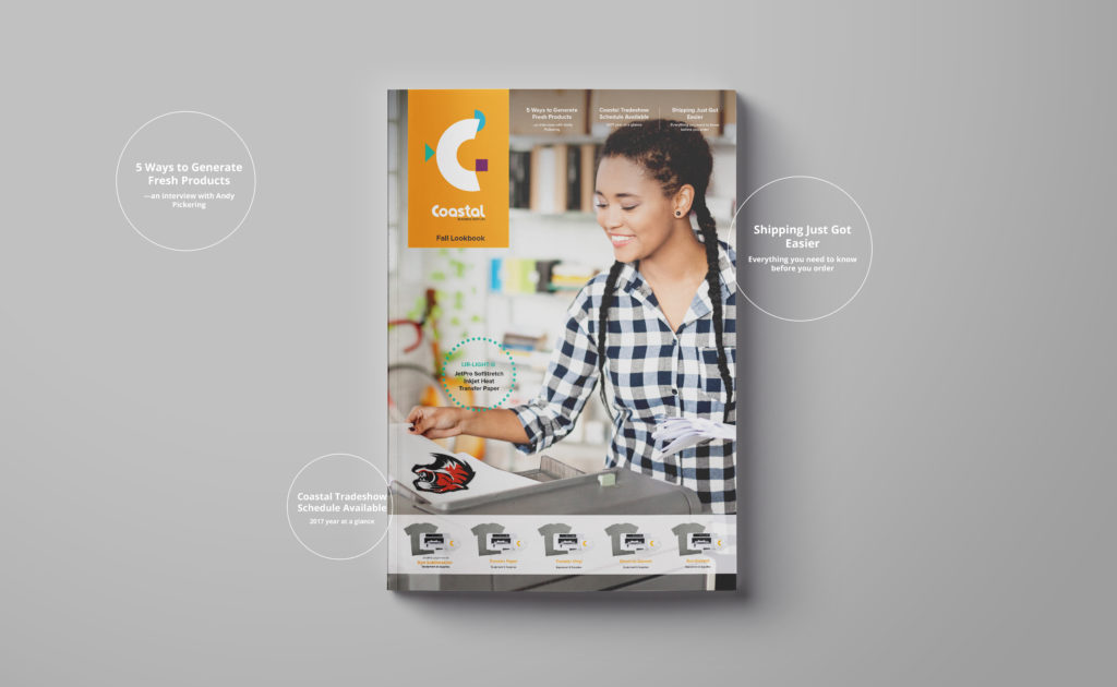
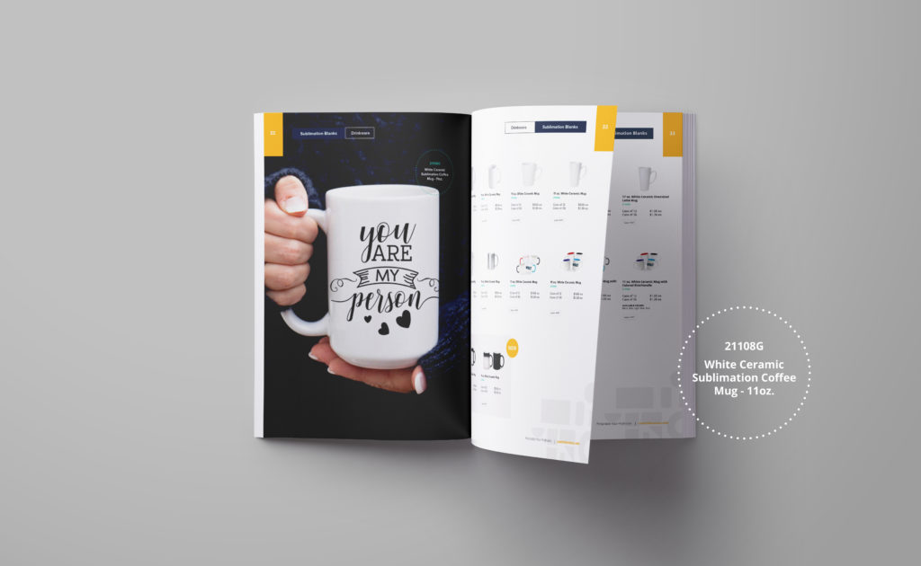
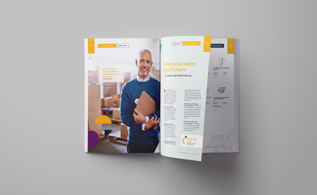
From there, we explored ways to apply the brand across all touch points: trade shows, the website, shipping boxes, a quarterly catalog-magazine hybrid, and advertisements.
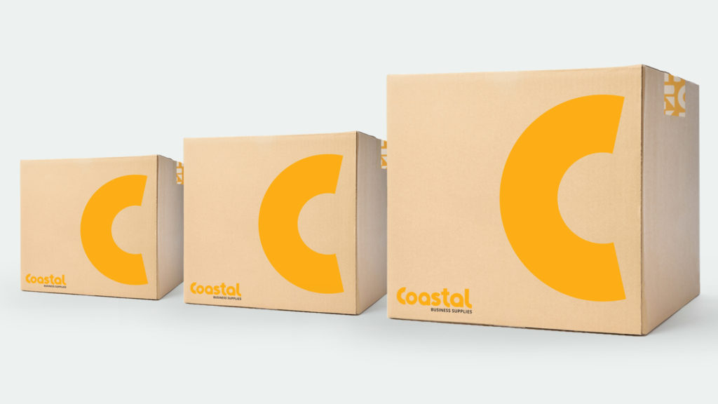
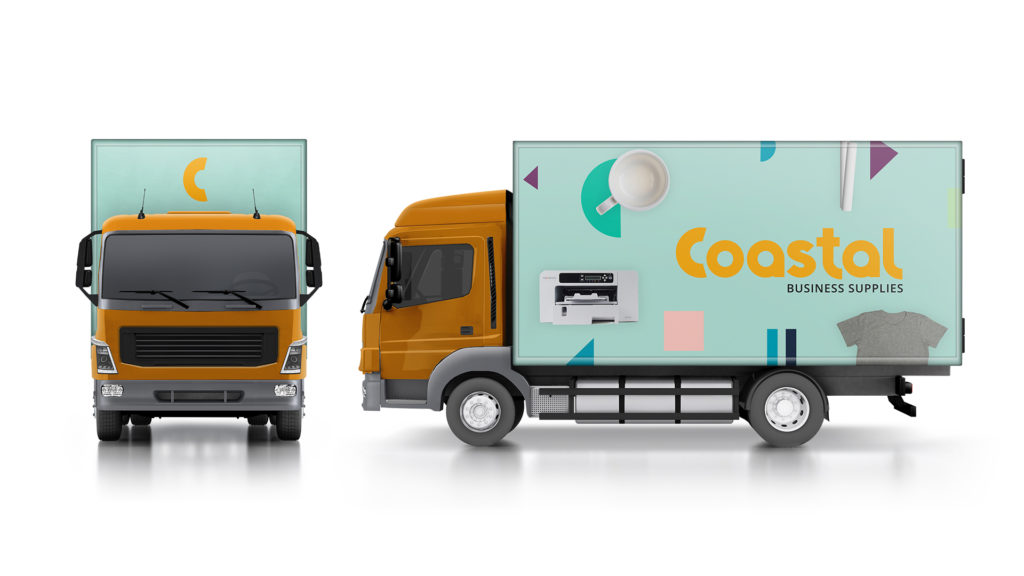
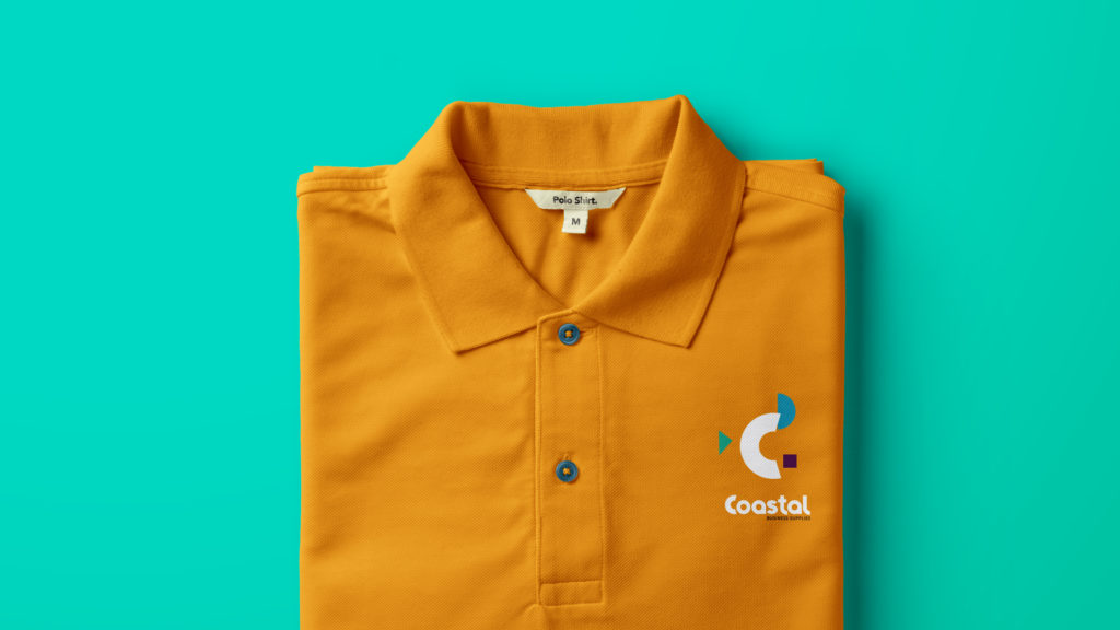
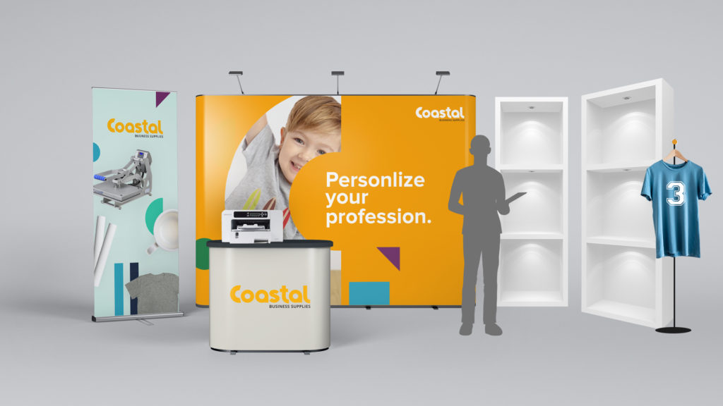
Pieces made specifically for business owners focus on the ways Coastal can help them create success on their terms. Photos show these business owners in casual, confident poses. Pieces made specifically for hobbyist audiences focus on the ease of personalization and the breadth of applications. And product-focused pieces work against the industrial, gray look of the equipment with exuberant color and clever language.
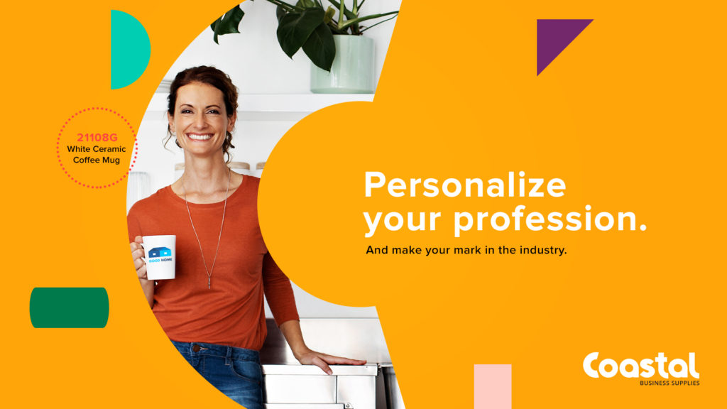
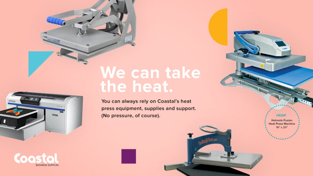
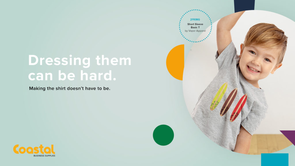
Throughout, the tone is friendly, fun, coaching, empowering, and clever.
We’re excited to share that Coastal is officially rolling out the brand today – check out their blog post about it! Congratulations to the entire Coastal team as they enter this new era bigger, brighter, and ready to inspire a new wave of business owners.
Want to keep up with the latest work from Atomicdust?
Subscribe to our newsletter for all the latest news, events and weekly marketing tips from our team.
