Branding / Website Design
RedCard
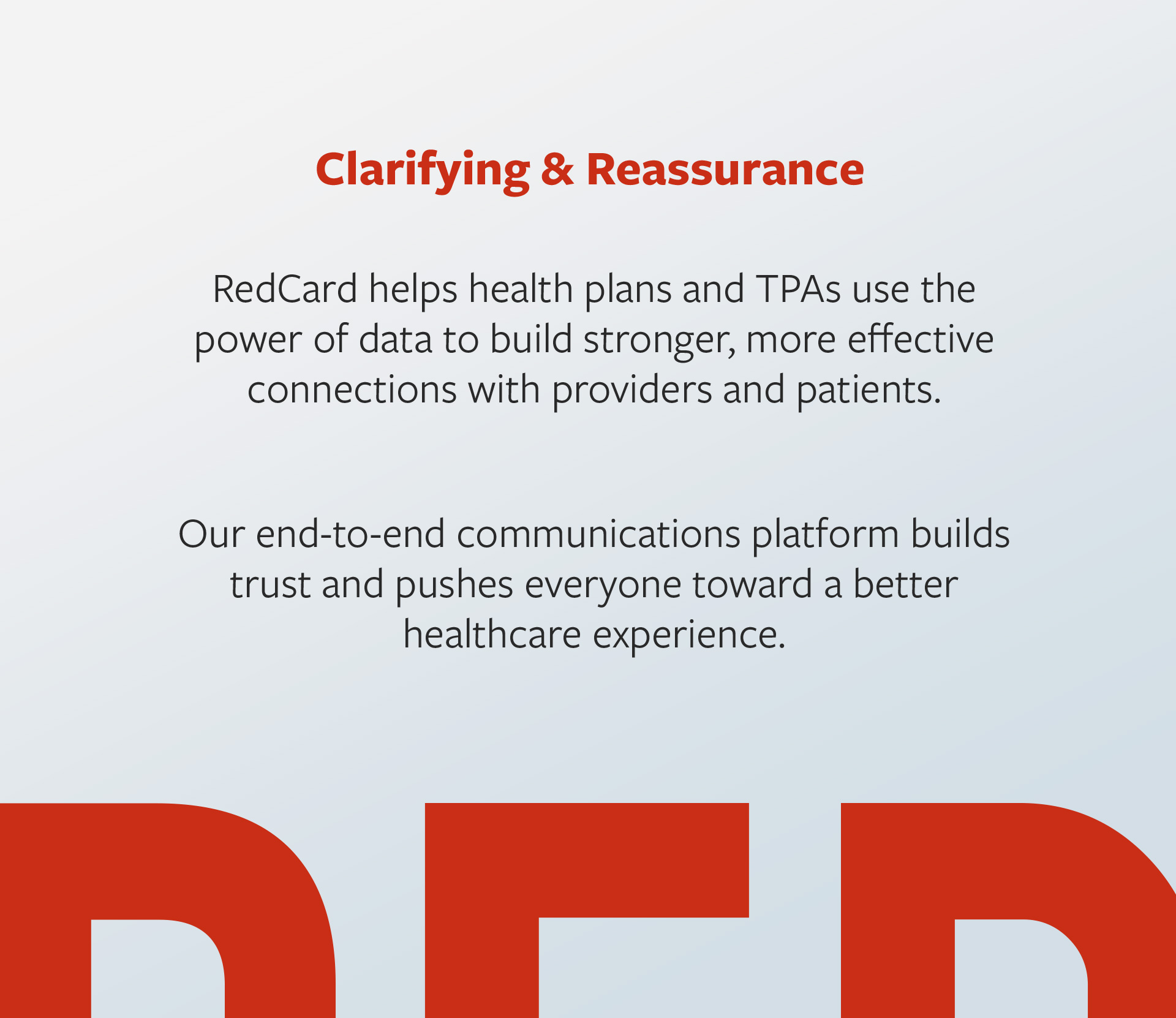
Amidst tremendous growth, RedCard turned to Atomicdust to help clarify their brand and express it in a variety of ways, starting with a bold new website.
Amidst tremendous growth, RedCard turned to Atomicdust to help clarify their brand and express it in a variety of ways, starting with a bold new website.
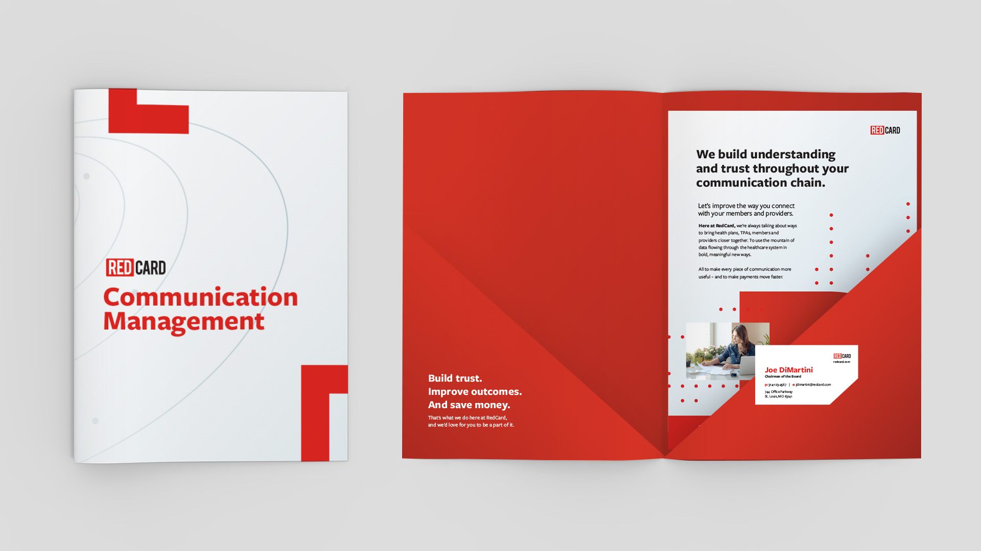
RedCard provides communication management services to health plans. From a tactical perspective, they help companies manage and produce things like ID Cards and EOBs. But they didn’t want to be seen as a production house. With a broader vision for the impact these items have on their clients, they looked to Atomicdust for help.
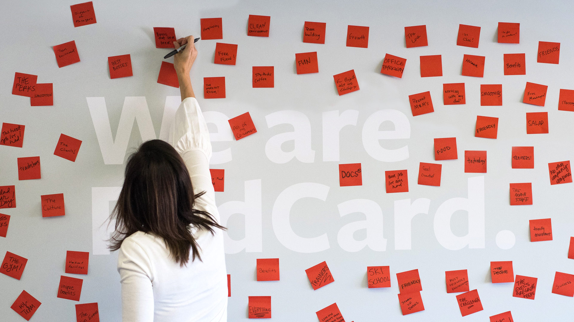
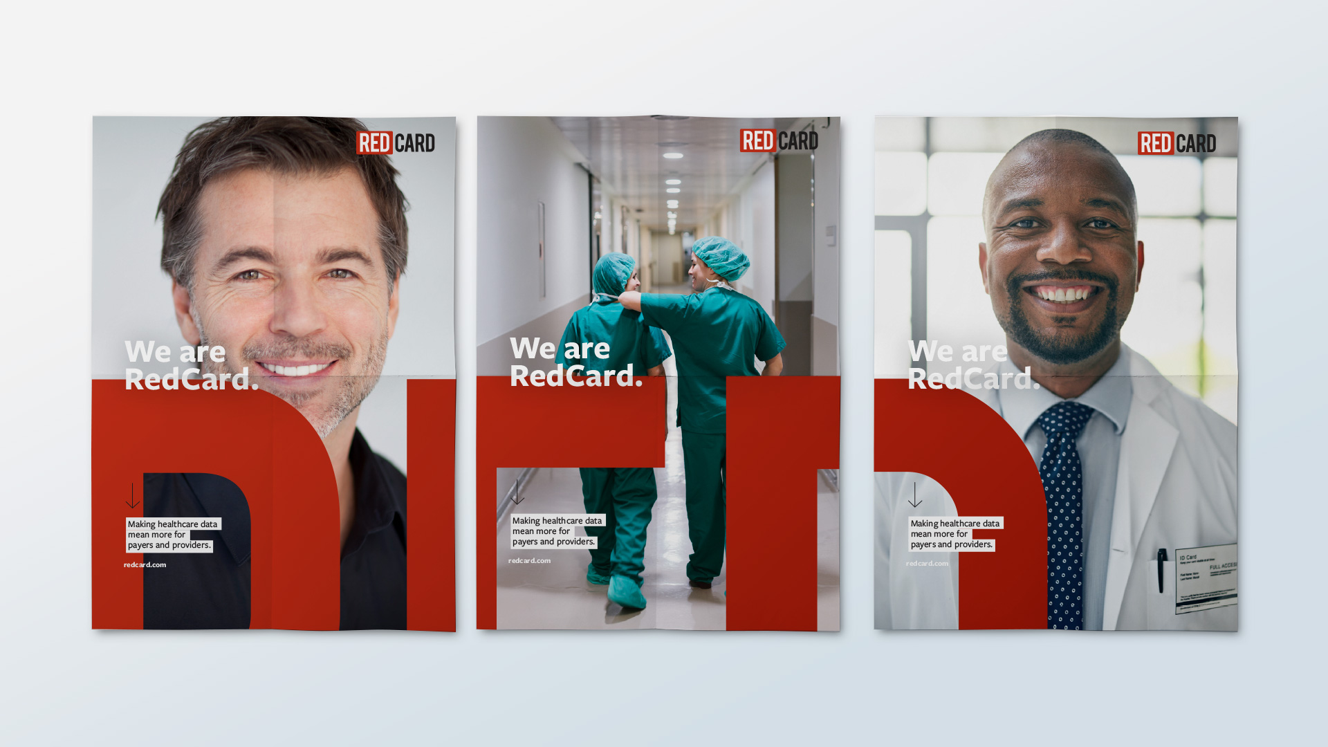
We slightly tweaked the red in their existing logo to be friendlier and more approachable. We evolved their tagline from “I am RedCard,” which emphasized the individual, to “We are RedCard,” to reflect their emerging focus on community.
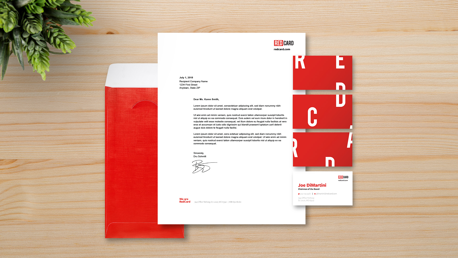
This idea of community-building – to bring together health plans, care providers and even members with the power of better communication – is disruptive in the industry. So we created brand elements to match this attitude, even blowing apart the logo and scattering the letters to add interest to standard pieces like business cards and the website.
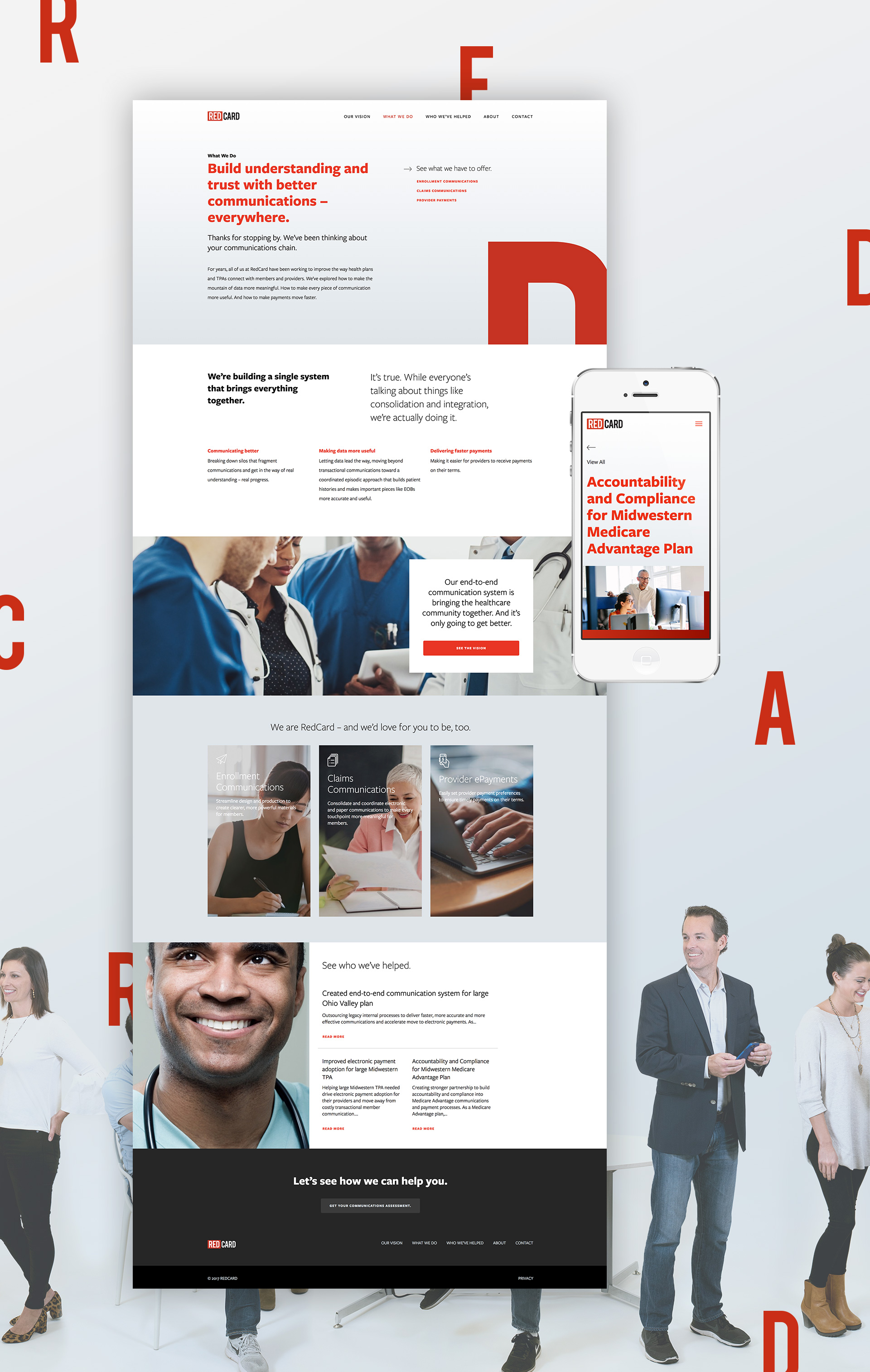
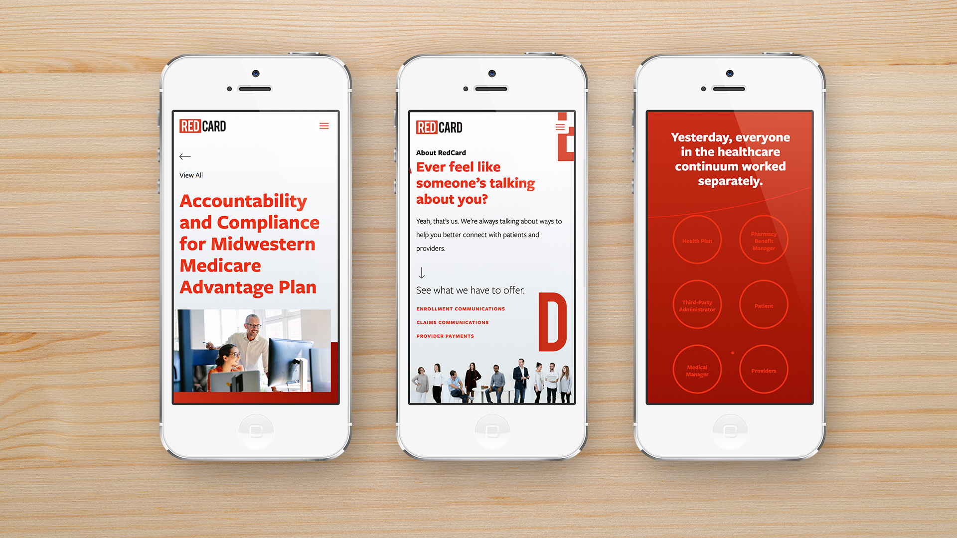
On every page of the RedCard website, we worked to clarify the benefits their services bring to clients and the healthcare community at large. One section we’re particularly fond of is the Vision page. We built the experience using parallax sections with accompanying CSS animations. What starts out as separate circles animate as you scroll, weaving in and out, visually connecting. It’s a bold invitation for prospects join RedCard on a journey toward a brighter tomorrow.
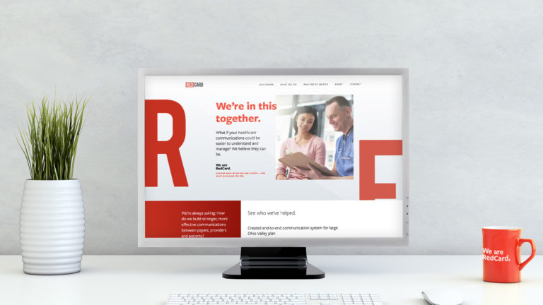
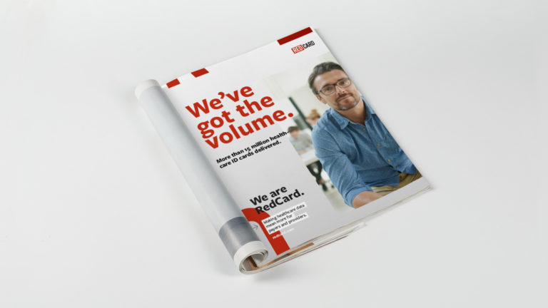
We’re continuing to work with RedCard to help them connect with their current and prospective clients, including gifts, tradeshow booths and even sales presentations. Watch this space to see where we go this year.