Putting Real People First in New Positioning and Website for Permobil
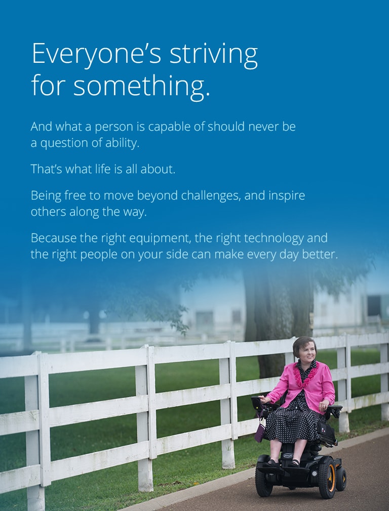
It might seem strange to start this blog post about our work for Permobil with the brand narrative we crafted for them. But it captures so much about the spirit of the brand, and so much about how the brand made us feel, it seemed like the only way.
Go ahead, read it again. Now, some context:
Permobil is a large, international company that makes high-end wheelchairs and seat cushions. Over the last several years, they’ve grown quite a bit. Most of their growth has come through acquisitions – which presented both challenges and opportunities to the company.
Two years ago, Permobil, headquartered in Sweden with U.S. operations in Nashville, was already a market leader in its own right, selling its growing line of high-end power wheelchairs. They purchased Pasco, Washington-based TiLite, the leader in custom manual wheelchairs. Next, they took on ROHO Group out of Belleville, IL, a maker of seat cushions and backs, primarily for people in wheelchairs.

Now with three distinct product lines spread across three U.S. locations, the company wanted to capture the best aspects of each brand, and to use these points to bring the company together around a consolidated message.
In turn, we knew this would become the foundation of the new website for their U.S. division.
We started our website program with a series of interviews, talking to people at all levels of the three companies. With so many stakeholders all over the world, we had a ton of information to analyze. A lot of directions to weigh. A lot of messages to compare and, in some cases to contrast.
With so much to figure out, we tried something new: an internal brand workshop.
The Permobil Brand Workshop
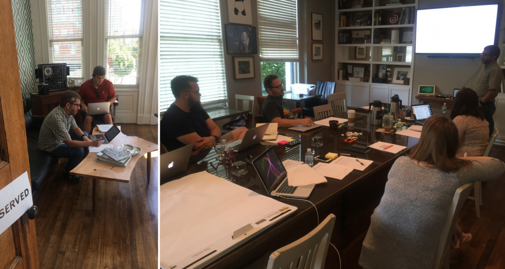
Early one morning, in a well-equipped meeting room far from the Atomicdust office, we gathered members of the core Permobil team, along with a selection of other Atomicdusters who were not familiar with the brand for an internal workshop.
Including those not familiar with the project may seem counterintuitive to a process designed for insights and speed. But it actually proved quite valuable. They forced us to break the Permobil brand story into its simplest terms. And they gave us a unique lens through which to see the brand: one much closer to how the public may view the brand, as opposed to those who had conducted hours of interviews with key stakeholders.
Using a series of exercises (and yes, even boring presentation slides), we started to recognize common themes among the three Permobil product lines. Their commitment to health and safety. Their traditions for making high-end products. The personal, customized nature of their business. But most of all, their dedication to improving the lives of people with disabilities with innovative technology – even in unexpected places.
As we dug deeper throughout the workshop, we saw more differentiating themes, particularly as we studied competitors, who tend to direct their marketing toward dealers and therapists, rather than end users.
The approach at Permobil is different. We heard again and again in our interviews that everyone at the company is there for the people who use their products. That sounds simple and straightforward, even cliché. But it’s a remarkably different approach for an industry that, at least in marketing, seems to be much more focused on the needs of clinicians and dealers.
So there it was, our core concept: while the industry focused on speaking to clinicians and dealers, we’re going to talk to the real people who will depend on these products every day. This idea of “real life” and “real people” would become central to our approach.
You already read the expression of this idea, at the start of this blog post. It set the tone for everything we did for Permobil – and drives the new projects we’re launching for them, even today.
Merging Three Websites Into One
Initially, we thought the core brand messaging would be the hardest part of the project. It usually is when we’re combining company cultures. We were wrong.
One goal with the project was to standardize the user experience across the three product lines, but to allow each line to maintain its own character. The broad range of content on the previous site that would need to move over showed us this would not be an easy task.
Each site had an enormous volume of information, from product specs and support documents to educational pieces, legacy support materials and… well, and more. Saying “and more” isn’t a case of being lazy – it’s just that there is too much to list here. Every time we went back to make sure we had captured it all, we’d find something else, hidden in some corner of the sites.
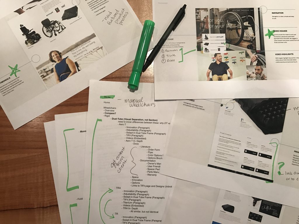
Plus – and here was the real challenge – everyone used the sites differently (even within the companies), looking for quick access to brochures, products, user manuals all in their own ways. Each site had been built to accommodate these methods – becoming a literal web of similar, duplicate and seldom-used content.
It was time to wipe the slate clean and create clear paths to critical information throughout the site. It was time to create an immersive, user-centric website.
Bringing Permobil to Life
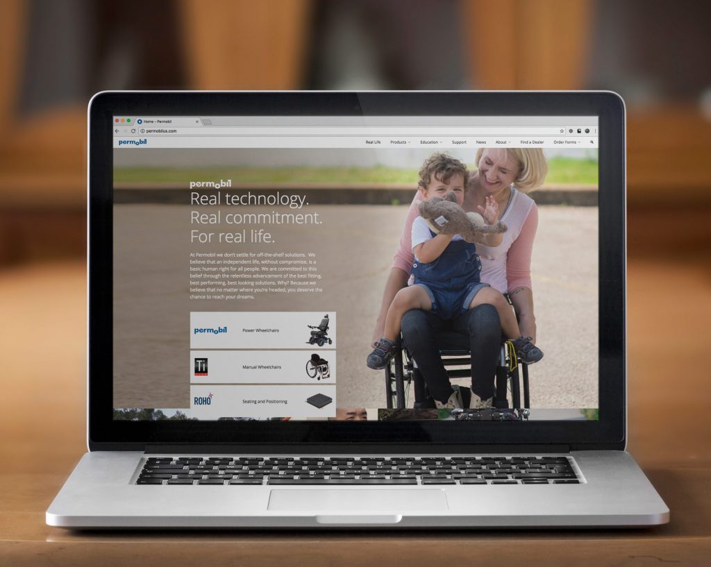
We get it – a big conglomerate claiming to be invested in “real people” sounds like pandering – but every step of the way, we worked with the company to ensure the photos and messages would always feel authentic and accessible.
This was a critical approach to the photography style – but also the idea behind the pops of video that appear throughout the site. It’s all designed to show the real-world application of the products in a comfortable, relatable way.

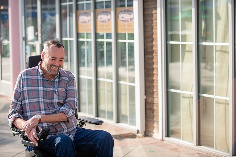

To capture these images, members of the Atomicdust team hit several spots around the country, taking our own photos and video and working alongside Permobil’s photographer, Kim Fetrow. The true-to-life images and video are critical to the new people-focused brand positioning.
This was also an excellent opportunity for us to meet Permobil’s customers in person, and to see for ourselves how Permobil’s products have changed people’s lives. We heard incredible stories of how even the smallest detail can make a tremendous difference in someone’s life. Most importantly, we met some incredible, inspirational people whose influences, stories (and, in some cases, faces) are all over the site.
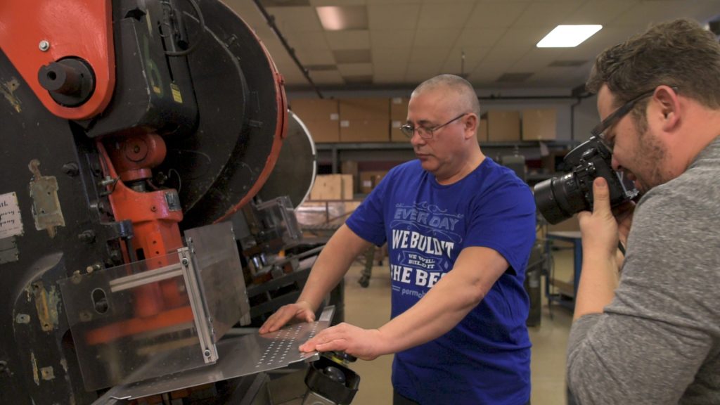
At the same time, we had several of Permobil’s products here in our office, including a power chair, a manual chair and several seat cushions. These were primarily for product photography, but they also allowed us the opportunity to see, touch and feel the products first-hand.
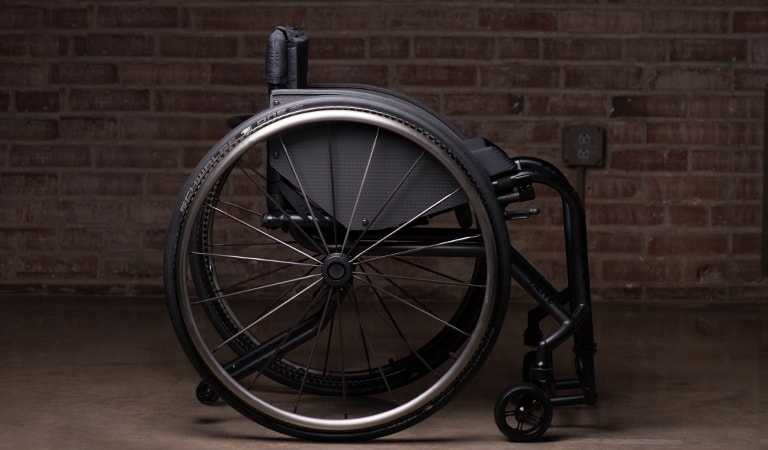
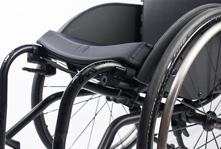
These perspectives were incredibly valuable as we looked for ways to make the products feel real and relatable.
A Tour of the New Website
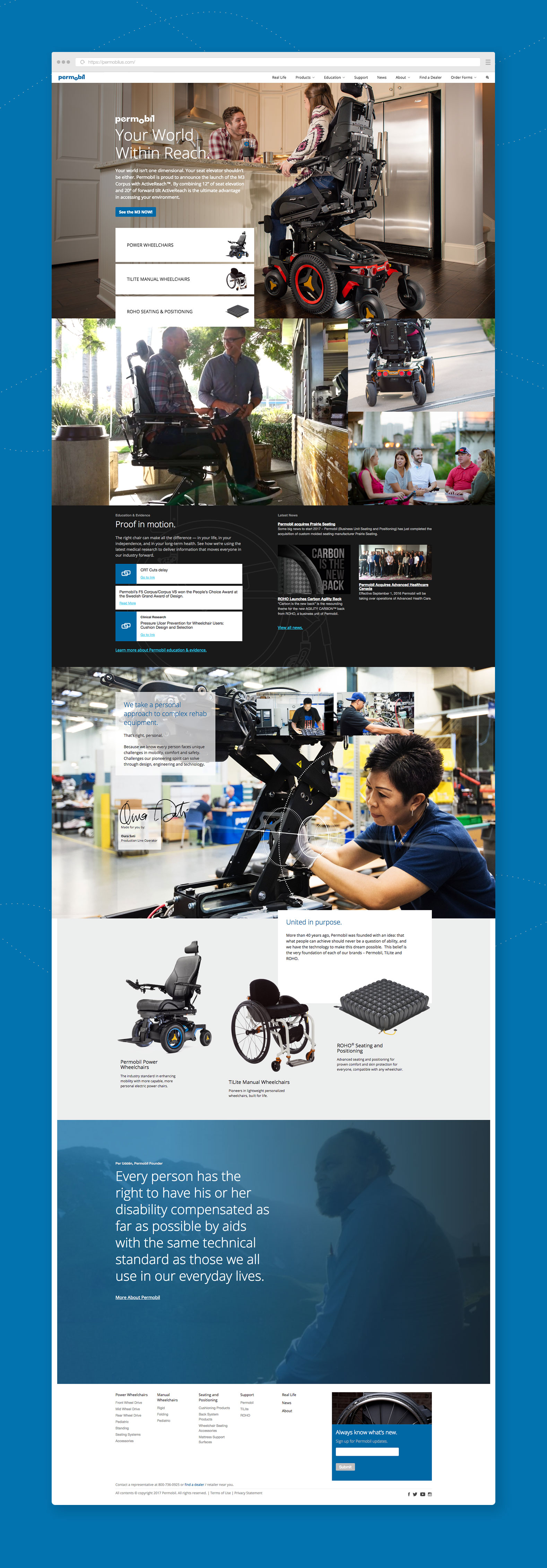 The homepage makes it easy for visitors to find what they need, from exploring specific product lines to jumping into resources, news, education or case studies from the main navigation.
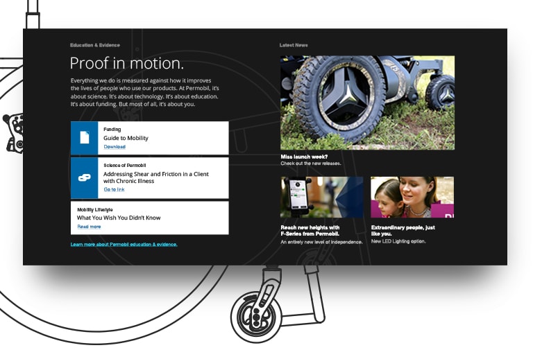
Further down the page, surprising bits of video bring a sense of literal motion to the website. This second stripe also introduces the idea of “Proof in motion,” that all Permobil products are created based on the latest medical research. Content in this section links to the “Education” section of the site, which further underscores the company’s commitment to sharing the latest clinical evidence with its customers and the industry.
Even further down, the page, the “made for you” section features real employees with their signatures, underscoring the personal nature of Permobil’s products. The idea was inspired by TiLite’s practice of including a card with each chair they ship, signed by everyone in the company who worked on the product.
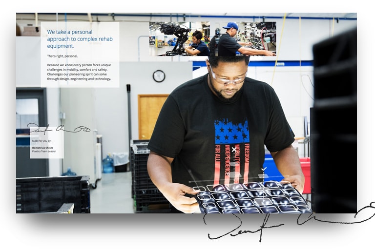
In addition to the employee signatures, we introduced the schematic overlay as another key design element on the site. Emphasizing the scientific, hands-on approach in a unique, eye-catching way, the schematic appears in several surprising places throughout the website, and has started to appear in other Permobil branded pieces, too.
This structure is repeated throughout the website design, both on the product line overview pages and on the product-specific pages. On these pages, the stripes become context-aware, delivering product-specific information and quick links to information visitors might need most.
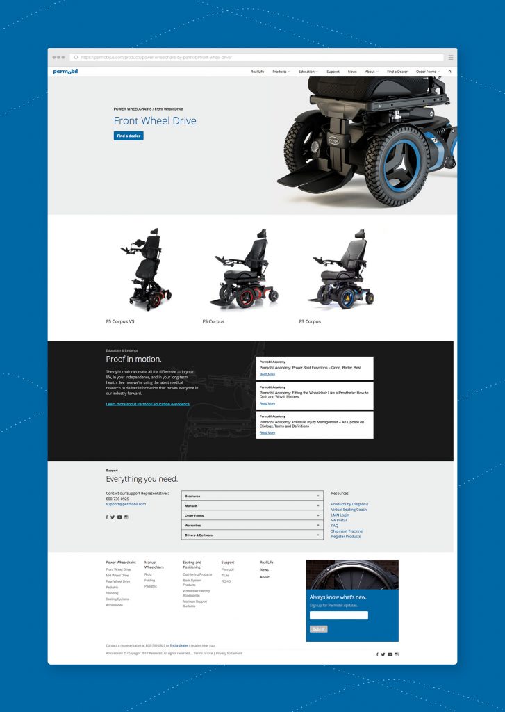
On product-specific pages, we’ve given the products room to shine, placing them on stark white background to accentuate details. It’s a high-end approach that matches the high-end nature of Permobil’s products – and it’s all balanced by easy access to critical information people need every day, like manuals, warranties and driver downloads.
Setting the Stage
 As is always the case, we know Permobil’s website is just the beginning of their evolution. They’re continuing to grow by acquiring new companies. And now, they’re starting to turn their eyes toward incorporating parts of our brand messaging and design into their global website. We’re excited to see where this inspirational brand heads next.
Want to keep up with the latest work from Atomicdust?
Subscribe to our newsletter for all the latest news, events and weekly marketing tips from our team.
