How Does Restaurant Branding Differ from Corporate Branding?
Believe it or not, branding a restaurant is not that different from traditional, corporate branding.
For years, we’ve worked within more conservative, business-to-business markets, but have recently found ourselves doing more and more branding and design for local restaurants. How do you go from designing sales sheets to designing the interior for an arcade bar? The truth is, it’s not that different.
Despite having wildly different industries and audiences, each requires a similar approach. We’ve found that it all comes down to three key principles:
- Build everything around a core message or concept
- Understand the customer experience
- And create a cohesive look and feel.
The Core Message
A brand is so much more than a logo, or color palette, or sign on the front door. It’s more than just the visual identity – a brand should be reflected in the language used, the products and service delivered and the experience of the customer.
Take, for example, our work with James Beard award-winning chef Gerard Craft on his restaurant in downtown St. Louis, Porano Pasta. The concept was a departure for Craft, who was known more for his more upscale offerings, but he had a vision. On a family trip to Porano, Italy, he had discovered a sense of warmth and community built around sharing simple, delicious food, and he longed to bring this feeling back to St. Louis.
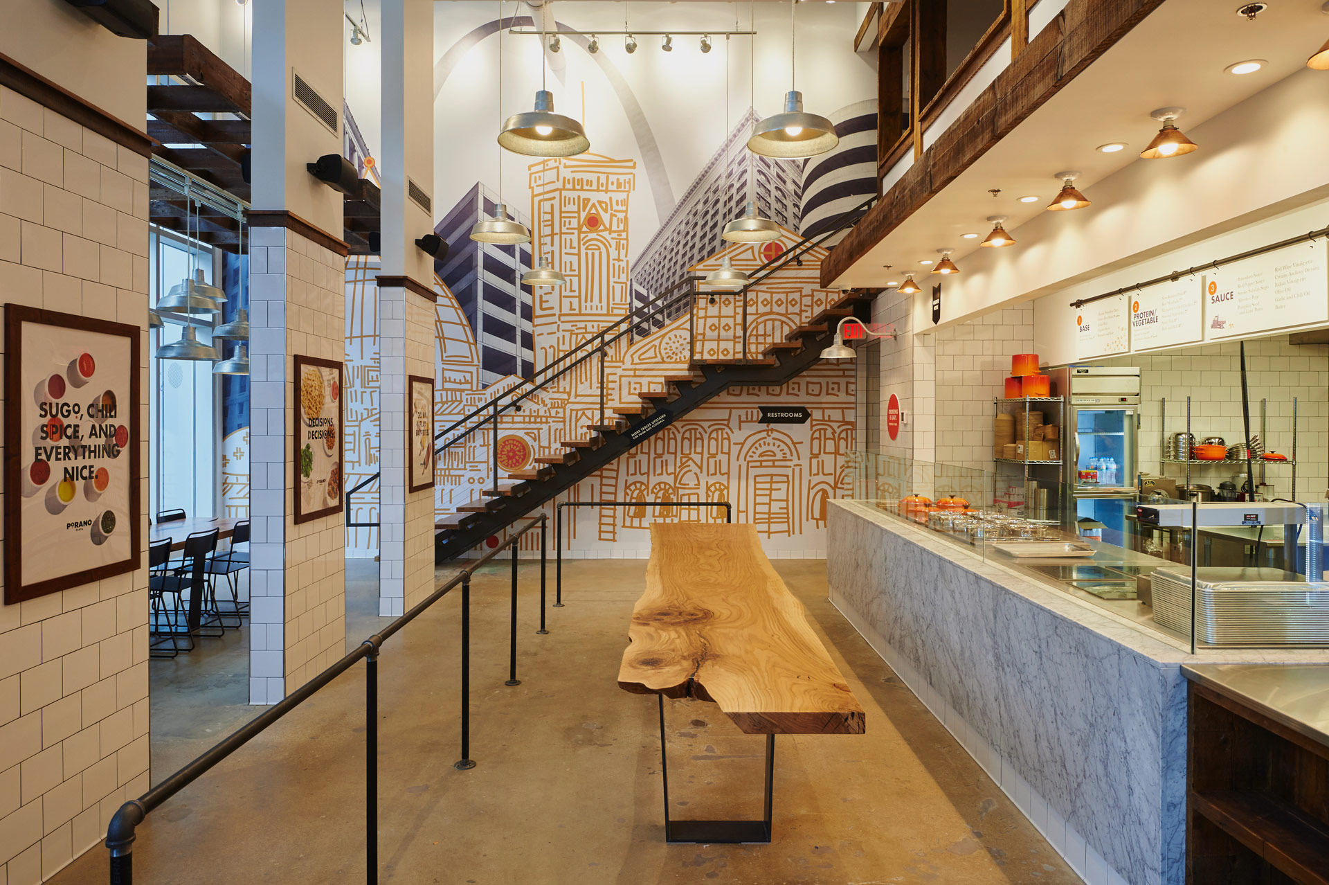
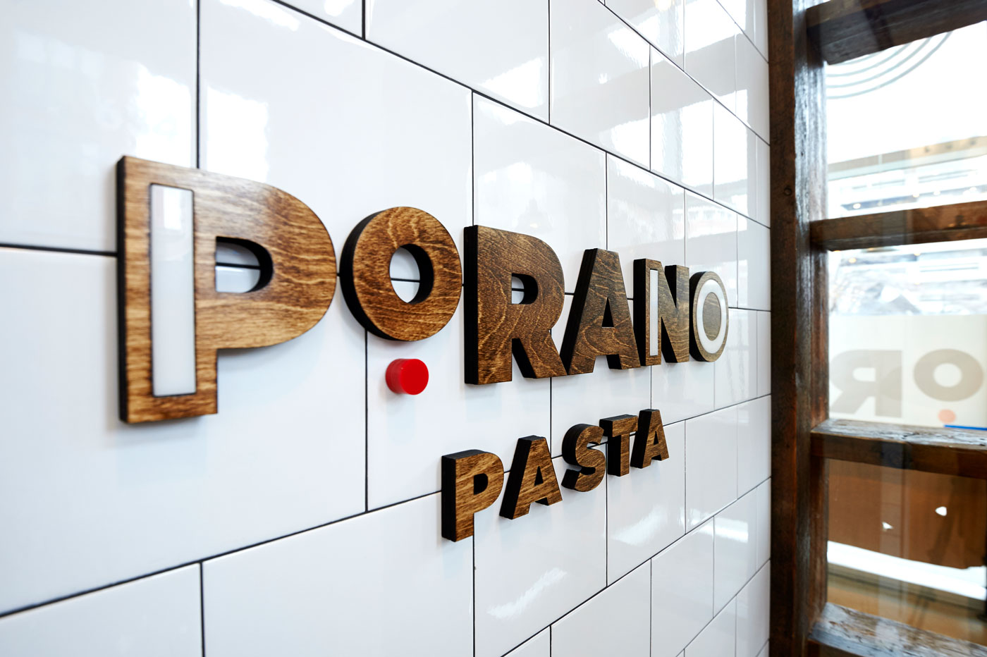
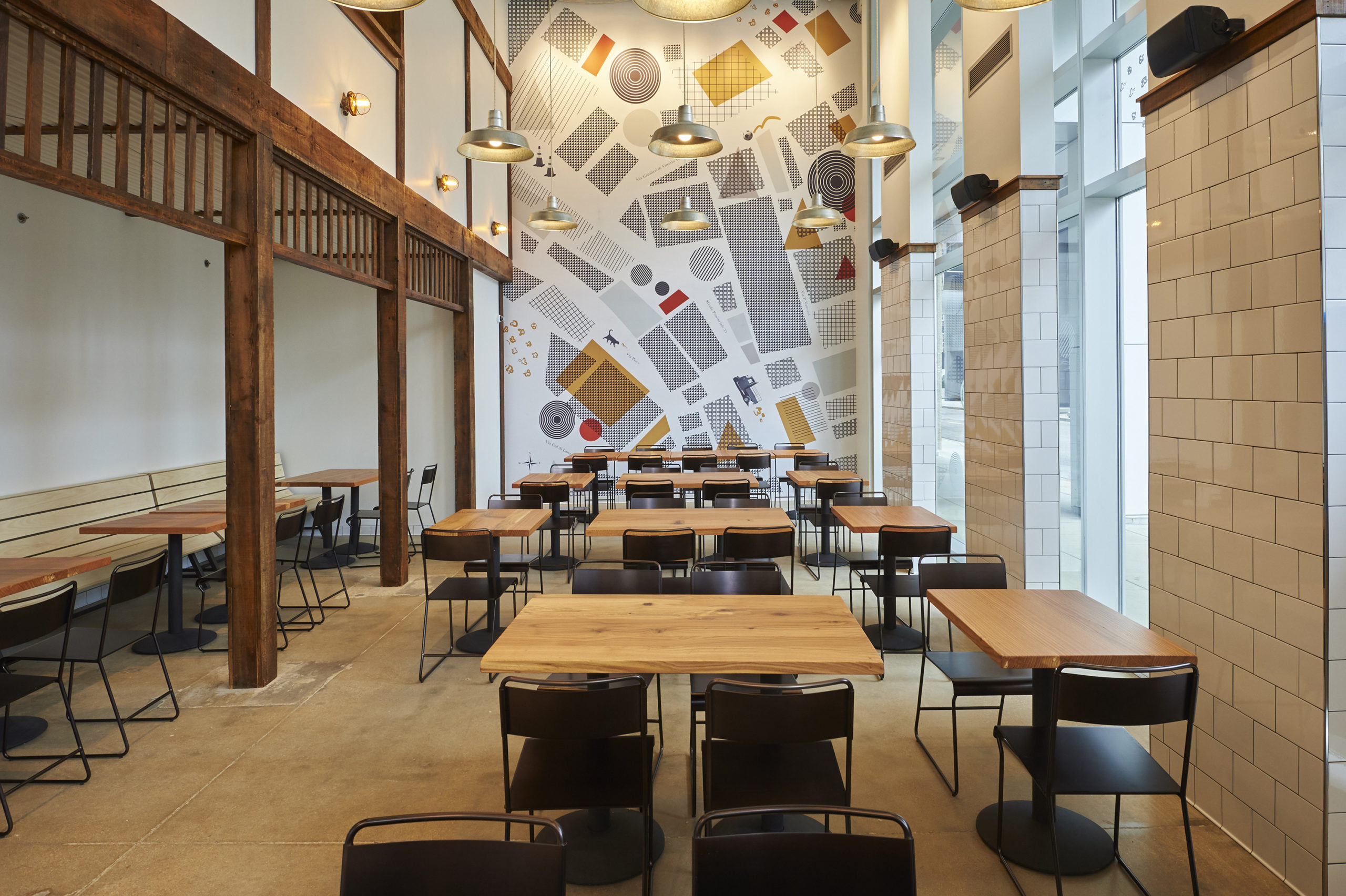
The “fast casual” concept at Porano works as you’d expect. There’s a menu of favorite pasta bowls, salads and pizzas, but guests can also create their own bowl from the list of ingredients. There are literally thousands of combinations, so everyone can create something they like.
We took a similar approach to our graphics in the space, mixing both modern and mid-century modern styles to create a look that’s uniquely Porano. Illustrations of Italian-influenced buildings were fused with images of our own contemporary city to create a striking mural in the main hall. On another wall, a map reflects the real town of Porano.
Everything about the brand, from the food to the decor, is a reflection of the core Porano message and concept.
Understanding the Customer Experience
Understanding your audiences is a basic principle of marketing for all industries, not just restaurants. For any business, being able to anticipate the needs, challenges and desires of your customer is necessary for success.
For restaurants, it often comes down to putting yourself in a customer’s position from beginning to end. How will they feel when they enter the restaurant? How will they order? What will they remember? What will they tell their friends about?
The focus on customer experience was particularly important as we set out to rebrand Crazy Bowls & Wraps. Crazy Bowls believes in good food, and in doing good for the community and world. They believe that “going for the good” can be simple, fun and delicious.
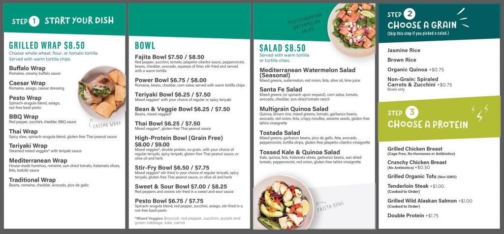
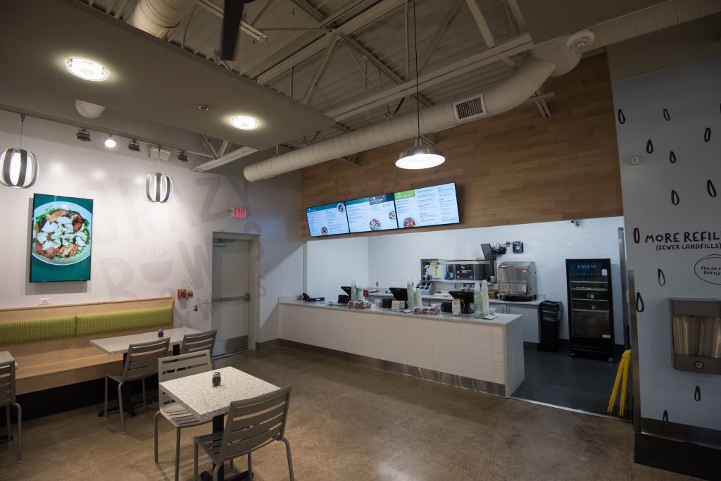
But because their menu offers so many options, cashiers frequently needed to walk intimidated customers through the ordering process and options. This was slowing down the line and creating a pressured environment at the register.
We reorganized the menu’s information and design into a clear three-step process. The new design ensures the eye can move from left to right, from decision to decision, without having to dart back and forth. Customers are now more likely to know what they want before it’s time to order.
A Cohesive Look
Again, a brand is not isolated to the logo or the sign on the door; it lives in every interaction with the customer. Considering small details makes the venue feel unique. Make your customers feel as though you’ve thought of everything.
When we were tasked with branding and designing the interior of Start Bar, the first bar-arcade hybrid in downtown St. Louis, it was easy to get lost in the big (5,000 square foot) decisions that had to be made. Where would the arcade cabinets go? What color would we paint the walls? What kind of lighting should we get? What color should the bar stools be?
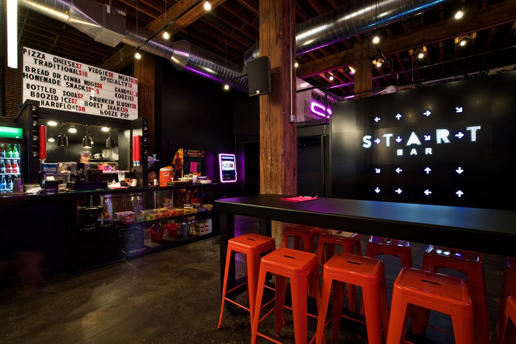
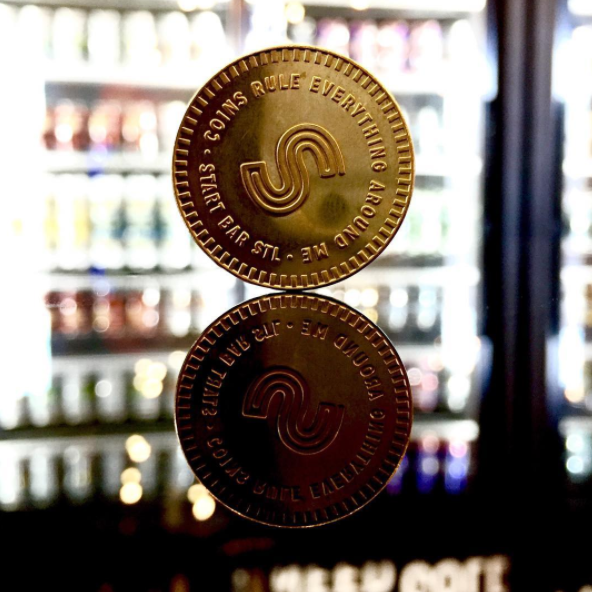
But it was the smaller details we were most excited about. Painting the bathroom tile to create Space Invaders. Touches of pink neon on windows and murals. The marquee-style menu board. And the smallest, but perhaps most significant detail – designing the one-inch arcade coins.
The attention to detail takes some extra work, but now we can ensure that no matter where a customer encounters the Start Bar brand, it will be consistent and cohesive.
As it turns out, traditional corporate branding is not so different from branding a restaurant. Sure, each has its own set of unique challenges, but if you start with a strong message, take time to understand the user experience and create cohesive expressions, you’ll find that you can build strong connections with customers.
Stay up to date on the latest marketing insights from Atomicdust.
Sign up for our newsletter and we’ll send you weekly marketing tips from our team, as well as the latest news and events from Atomicdust.

