Atomicdust Helps Artesys Brighten Up Financial Services
A few months ago, we got a call from our friends at Artesys about updating their website. It hadn’t changed much in the last five years – when we initially worked together on their first site – and was in need of an upgrade. Beyond having something that felt crisp and new, our clients wanted to match their approach in the industry, something completely different.
Artesys is a managed account program from the advisors behind R.T. Jones Capital Equities Management, Inc. If that doesn’t immediately sound distinctive for a financial services firm, don’t worry. The core of Artesys is that they manage retirement accounts, so individual investors don’t have to – limiting the chance of making common mistakes.
We used that central message to help talk to visitors, and potential customers, in a real, relatable way. Investing naturally comes with a lot of questions, so we provide as many answers as possible upfront, on the homepage. We focused on explaining who Artesys is, what they offer and how that’s beneficial for each of their audiences.
In addition to being a hub for information, the homepage also anchors the story by illustrating how Artesys is different. To keep visitors interested along the way, we took an animated approach for both the web design and development. As visitors scroll, pieces move and information flows – revealing small bits of content that break down the tricky details behind investing with Artesys.
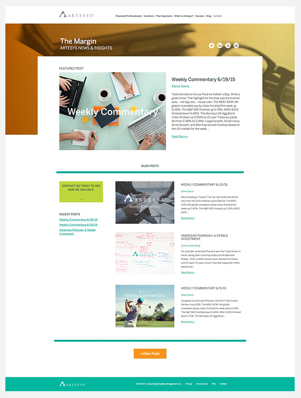
As you dig deeper into the site, the content continues answering questions in a clear and easy-to-read way. Since our clients had already discovered the value blogging has in becoming industry thought-leaders, pages on the site prominently feature a feed from their blog, “The Margin.”
Now, our clients are excited to have a more engaging user experience than what’s expected on an investment website. We were glad to help liven up such a conservative industry.


