Branding topics
Creating Your Brand’s Identity, Beyond the Logo

Branding is how your organization or business communicates itself to the world. It’s the personification of your business, embodying its voice, goals, and vision through intentional messaging. This messaging is both verbal and visual.
“Visual Identity System” is a marketing term used to describe all the visual elements of your brand. This includes graphic imagery, colors, typography, and of course, your logo. Having a clear brand identity will help you create messaging and deliver it to your target audience in a consistent manner.
With a unified visual identity system, people will immediately recognize your logo and the accompanying visual elements of your messaging as uniquely belonging to your company. It will act as a trigger to awaken memories of your products and any associated experiences that the audience might have.
Here are three essential elements every strong visual identity system should contain.
Logo
Logo is likely second on your branding to-do list after choosing a company name. It’s perhaps the most critical part of the visual identity system and will work to promote instant public recognition for your brand.
Logos are typically symbols or icons paired with words. Logos may often have hidden meanings that speak to their brand’s identity (here are some famous examples).
Ultimately, as your brand matures, its logo may become recognizable even without the name attached.
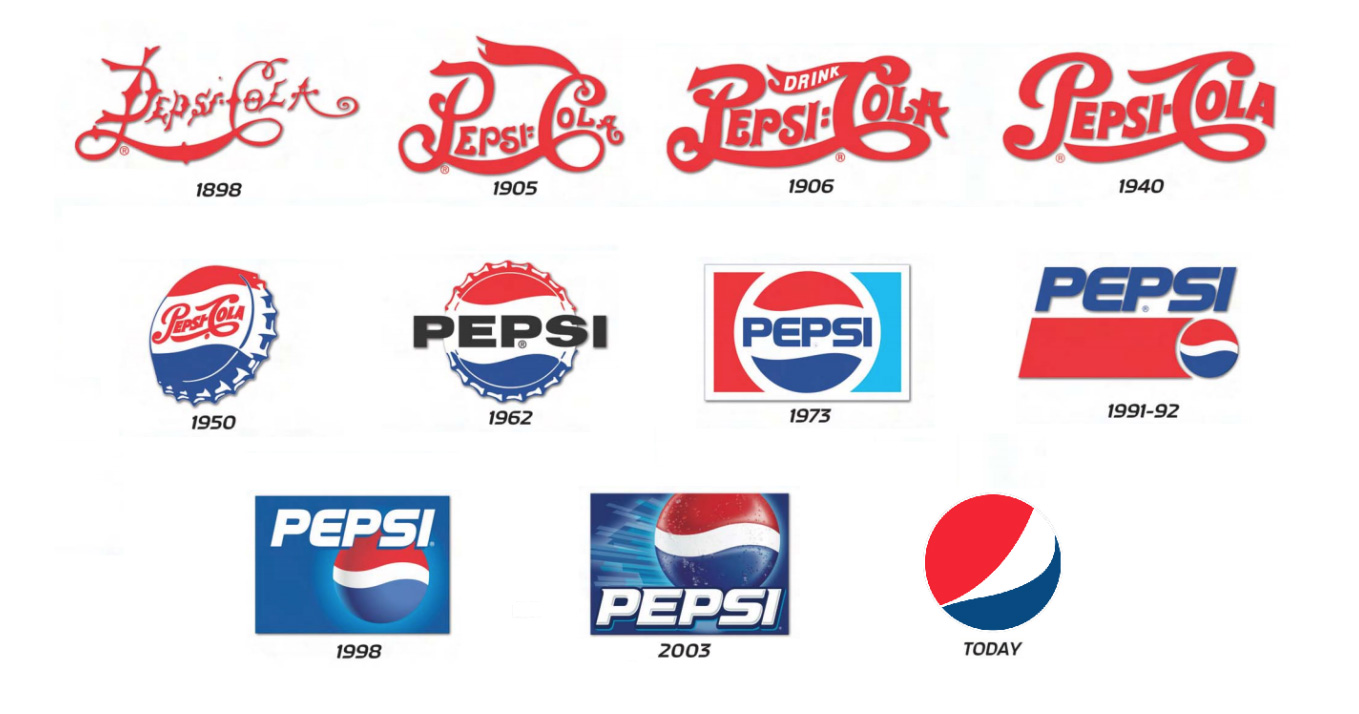
Think of Pepsi. Its logo is recognizable in an instant to its millions of consumers worldwide. However, it didn’t start off that way. Logos can and should evolve with the company. That’s one reason for a greater visual identity system. As you can see below, while Pepsi’s logo did change over time, it still held true to many of the characteristics of the brand’s visual identity.

Color palette
Typography
Typography should be chosen just as carefully as your brand logo and colors. It should complement your other design elements and speak to your brand’s identity in the same manner.
Typography can say a lot about your brand’s personality. Is it serious? Is it silly? Just like handwriting, typography should be unique and distinguishable.
While there are thousands of fonts to choose from, don’t get overwhelmed yet! There are only a handful of font classifications (ie. serif, sans-serif, script, handwritten) and they each have their own personality traits, from classic to bold to elegant. Start by choosing a type of font and go from there.
Photography, Illustration, Video, and More
Your visual identity will expand beyond the three core elements of logo, colors, and typography to include many of the following and even more:
- Photography
- Illustration
- Iconography
- Data visualization
- Interactive elements
- Video and motion
- Web design
Remember that any visual element should speak to your brand’s personality. Go with your gut. If it doesn’t “feel” like your brand than it probably shouldn’t be identified with your brand. Trust the data too, and test images and other visual elements with your audience.
Ready to build an iconic brand identity?
Atomicdust is an award-winning branding & marketing agency based out of St. Louis, Missouri.
Our branding program provide branding services from the ground up, whether it’s bringing new insights to your established marketing strategy or creating a branding platform to build your identity on.
We combine research, creativity, and a unique outside perspective to help you craft messaging that will capture the interest of your audience and energize your employees. Learn more.

More branding topics
Explore more branding topics below – and if you’d like to talk about how Atomicdust can build an iconic brand for your business, visit our branding services.
Let’s talk branding.
(It’s pretty much all we talk about anyway.)

Question about branding? Want to discuss a project?
Fill out the form below, call us at (314) 241-2866, or click here to email Senior Account Manager Erika Cruse.
