Branding topics
What are Brand Standards?
Brand standards can become a guide for businesses – from the products and services offered, to identifying ideal customers, to the look and feel of a organization.
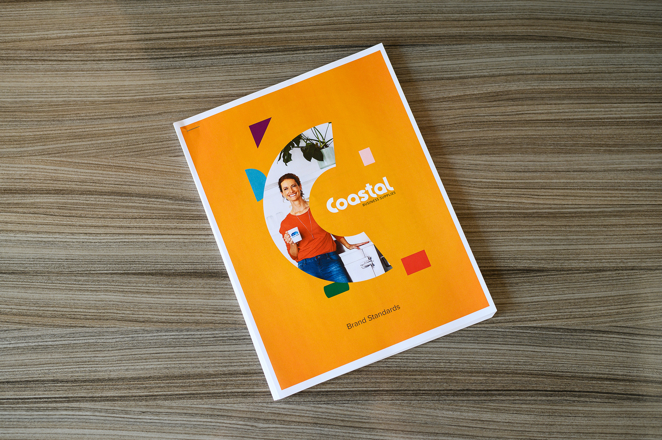
Brand standards determine how an organization presents itself across every platform. Having a well-defined and accessible brand standards guide creates brand consistency across marketing channels.
Building a strong and recognizable brand image lets customers experience a brand consistently across all platforms. If it’s publishing a new article on a blog, advertising on social media, taking out a full-page print ad in a magazine or crafting a companies letterhead, brand standards will ensure that a brand always tells the same story, no matter the medium.
A strong brand standards guide will keep an organization, internal teams and outside partners or vendors on the same page when designing and publishing new brand assets.
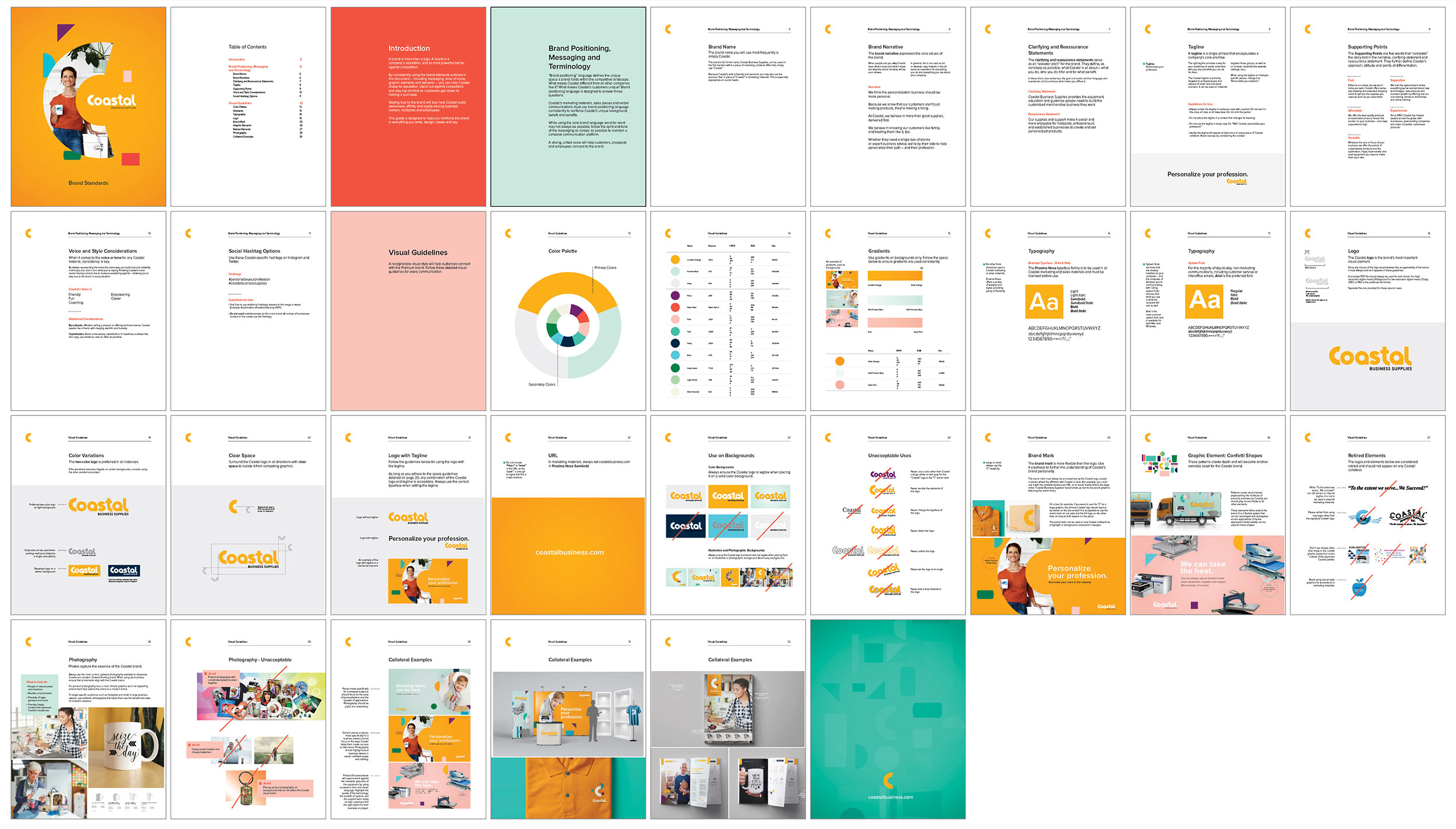
What Should Be Included in a Brand Standards Guide?
A brand story is the heart of your business, and having brand standards are the best way to tell share that story consistently every time. A brand standards guide should be built on five main components to effectively tell a brand’s story.
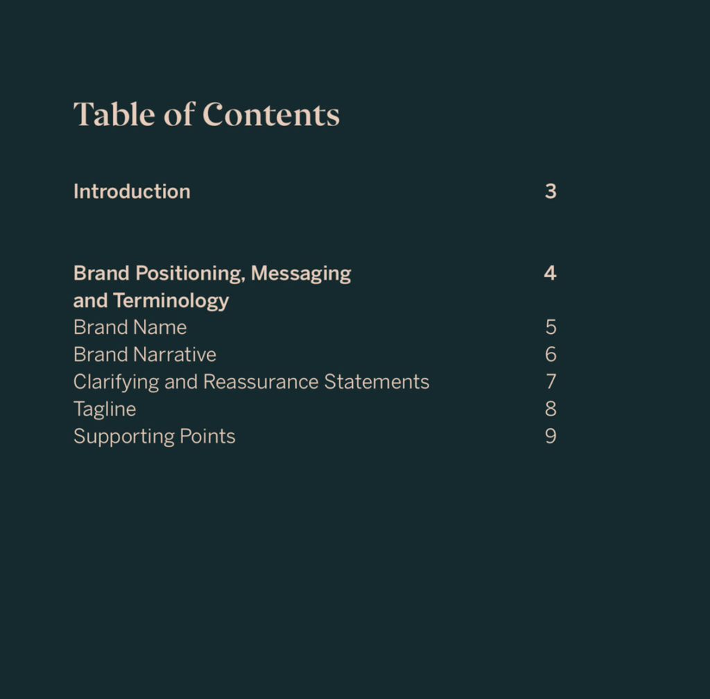
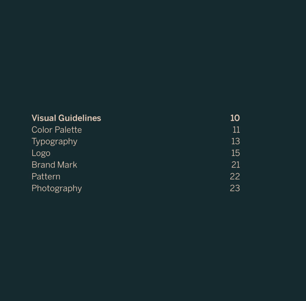
Component 1: Brand language
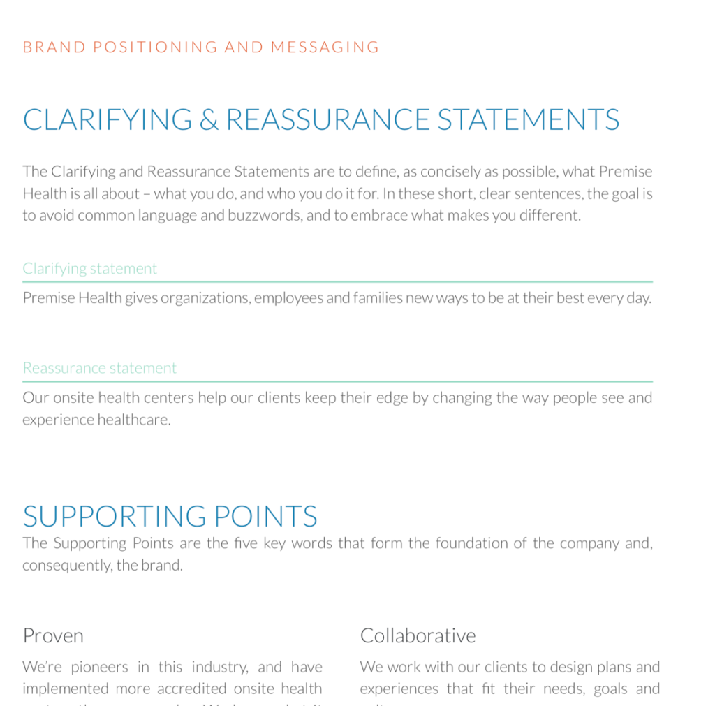
The focal point of a brand standards is brand language. A brand can determine everything about a business — from the products and services offered, to the ideal target customers, and the look and feel of your visual identity. That’s why it is important for you to start with a brands language before tackling a logo, color palette or typography. The first section of a brand standards might include:
- An introduction to a company
- A companies unique positioning within its industry.
- A companies mission and vision statements
- A companies core values
- A brief description of a companies products or services
- A companies ideal customer, or buyer persona.
The goal is to introduce the brand to anyone designing and producing content. They should be able to read the opening pages of your guide and understand who an organization is, what motivates it and how it want to be viewed by its customers, partners and competitors.
Component 2: Color palette
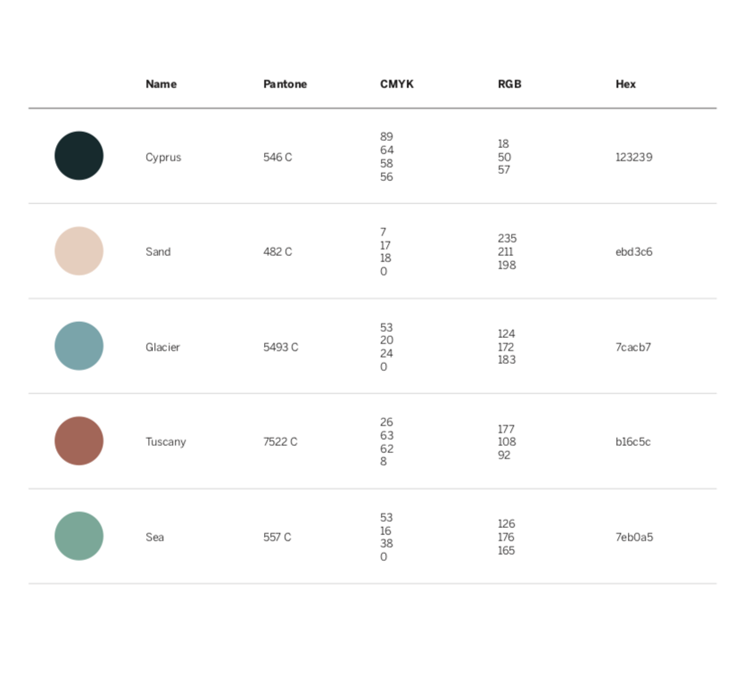
The color palette creates consistency within a brand and marketing materials. Colors project moods and evoke emotions that should match the brand’s identity and goals. A brand’s color palette in a brand standards guide is essential.
Most companies will have both a primary and secondary color palette. Often the primary colors are used in a brand’s main logo, on their website, and in their key marketing materials. Secondary color palettes will be used in special circumstances to create contrast and diversity within the brand’s material.
Detailing a color palette includes examples of the colors as well as the necessary Pantone matches, RGB or hex values to ensure the right color tones are used in every situation.
Component 3: Logo & visual identity
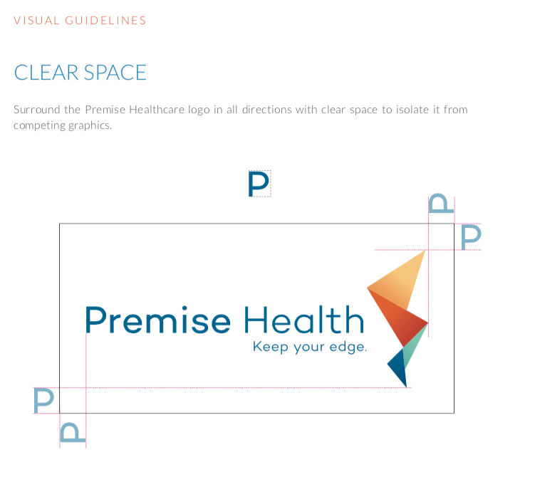
Logos are usually the most visible identifying marker for a brand, so it should be used correctly and consistently throughout a brand assets. The logo section of a brand standards guide should include your primary logo and any secondary logo variations, as well as guidelines for when and how to use it.
Logo details might also include appropriate colors from the color palette for logo backgrounds, how to use the logo over pictures, and which variation to use in email signatures, company letterhead, print ads and other marketing material. Including a few examples of right and wrong logo usage is a quick and easy way to communicate logo guidelines.
Component 4: Typography
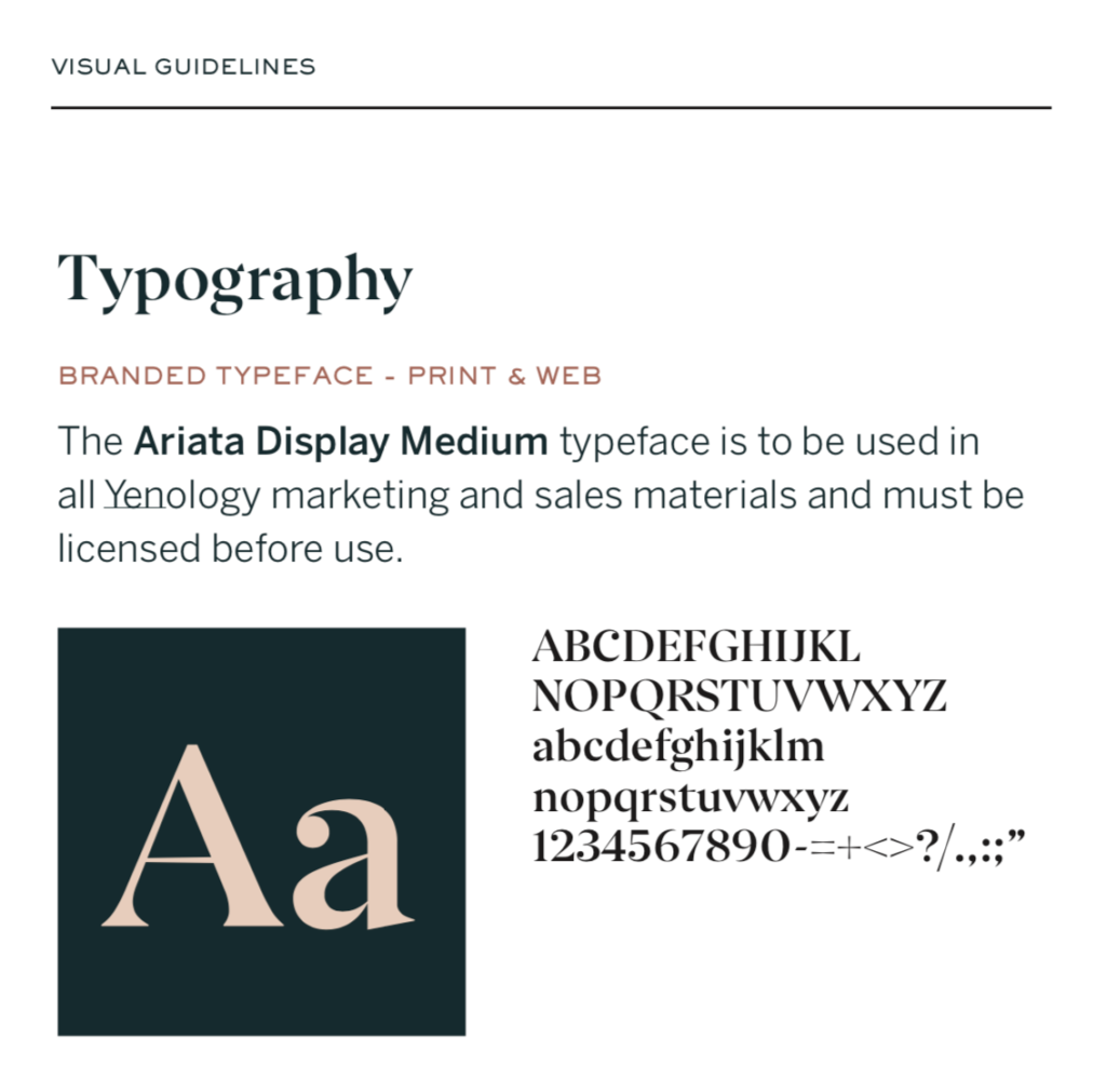
Personalized typography is a subtle yet effective tool to help a brand stand out. The primary typeface family, including examples and guidelines for when to use each variation, should be included in the brand standards guide. If there are multiple typeface families, there should be details on exactly when the secondary options should and shouldn’t be used. Spacing and allignment requirements should also be defined to make sure content is consistent throughout marketing materials.
Component 5: Imagery
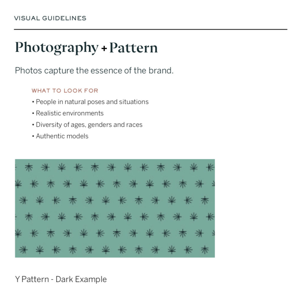
Images tell stories that evoke emotion from the viewer. Imagery should complement your brand’s story – not work against it – making it essential to define a style and tone to match your brand. Examples should be included along with a brief description of the look and feel of the images. A mood board is a great way to display and explain imagery that captures the vision and tone of the brand.

Striking a balance between uniformity and creativity
One of the biggest pitfalls of creating a brand standards guide is being too strict. Standing out in a crowded market requires creativity, flexibility and innovation, yet many company’s brand standards guidelines become more and more inflexible as the company grows.
Striking a balance between brand consistency and design flexibility is a challenge for even the most forward-thinking marketing teams. Erring too far toward consistency creates a flat and boring brand image where all of your design looks identical. A great brand standards guide details a high-level view of a brand identity while leaving some breathing room for creativity and innovation as a brand and industry develops.

We build great brands.
At Atomicdust, we know the value of great design in building brand equity.
Every day, our branding program helps businesses reinvent themselves and clarify who they are and why it matters to their audiences. We give brands strong, strategic foundations, and bring them to life throughout their customers’ experiences.
We would love to do it for you.
More branding topics
Explore more branding topics below – and if you’d like to talk about how Atomicdust can build an iconic brand for your business, visit our branding services.
Let’s talk branding.
(It’s pretty much all we talk about anyway.)

Question about branding? Want to discuss a project?
Fill out the form below, call us at (314) 241-2866, or click here to email Senior Account Manager Erika Cruse.
