Branding / Packaging / Website Design
Goshen Coffee
Goshen Coffee, a brand of hand-crafted, small-batch coffee, challenges what coffee brands should look like on the shelf and on the web.
Goshen Coffee, a brand of hand-crafted, small-batch coffee, challenges what coffee brands should look like on the shelf and on the web.
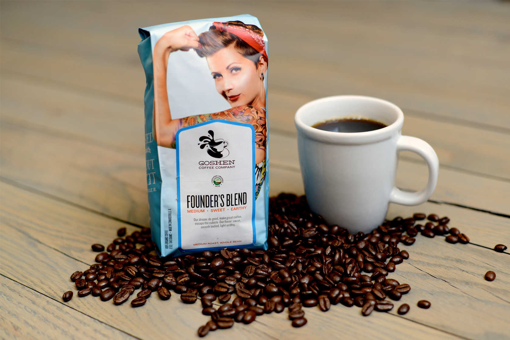
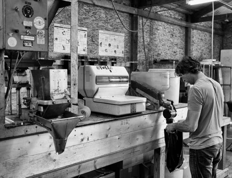
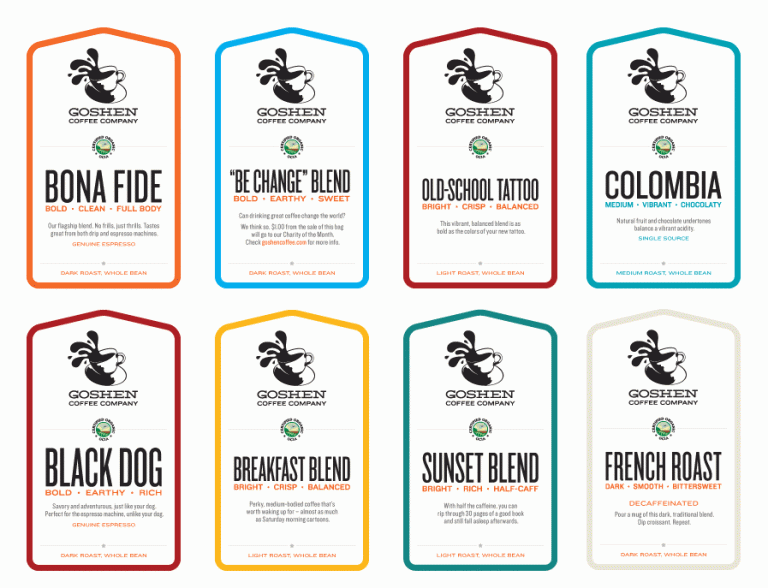
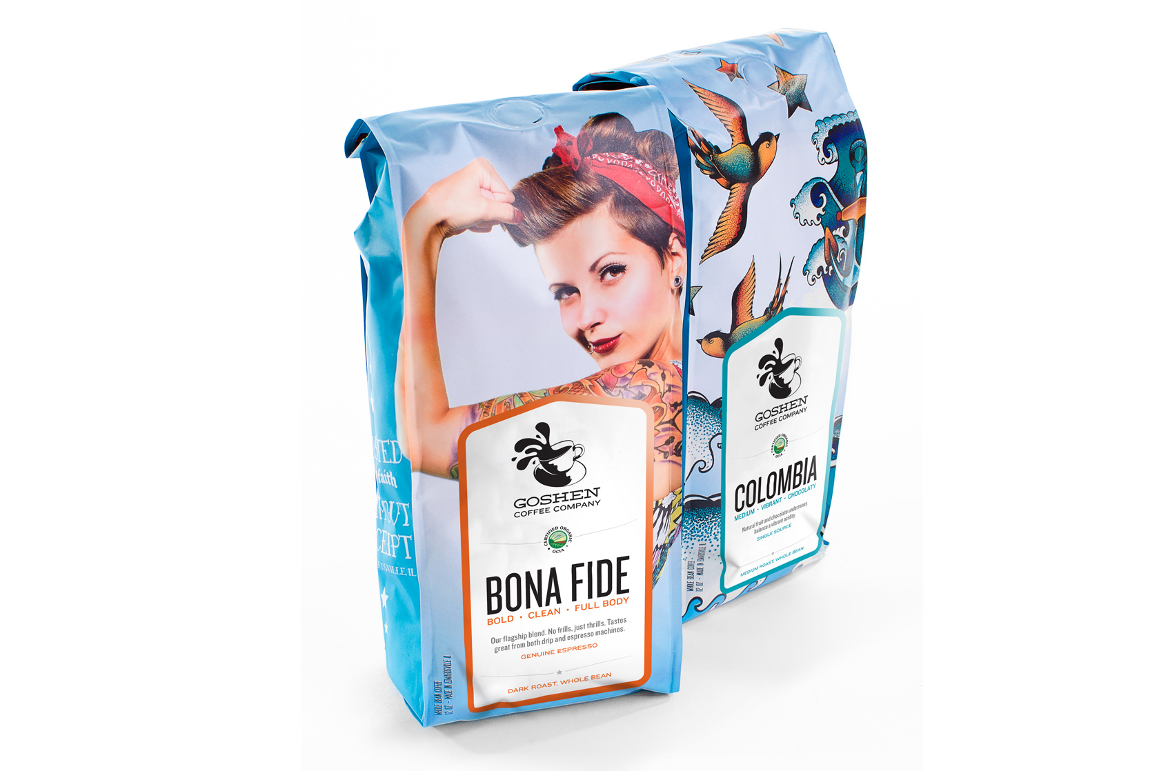
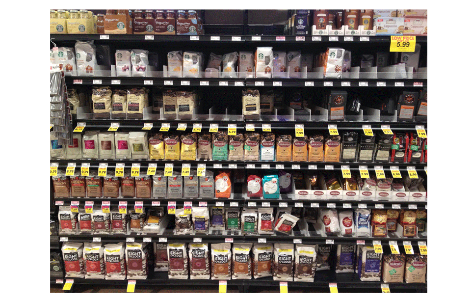
It didn’t take much time in the coffee aisle to realize what Goshen Coffee needed for its new packaging: a look that matched the care it takes to make great coffee. In an aisle of earth-toned packaging that all looks the same, we decided to create a package that would stand out on the shelf – with an attitude that was uniquely Goshen.
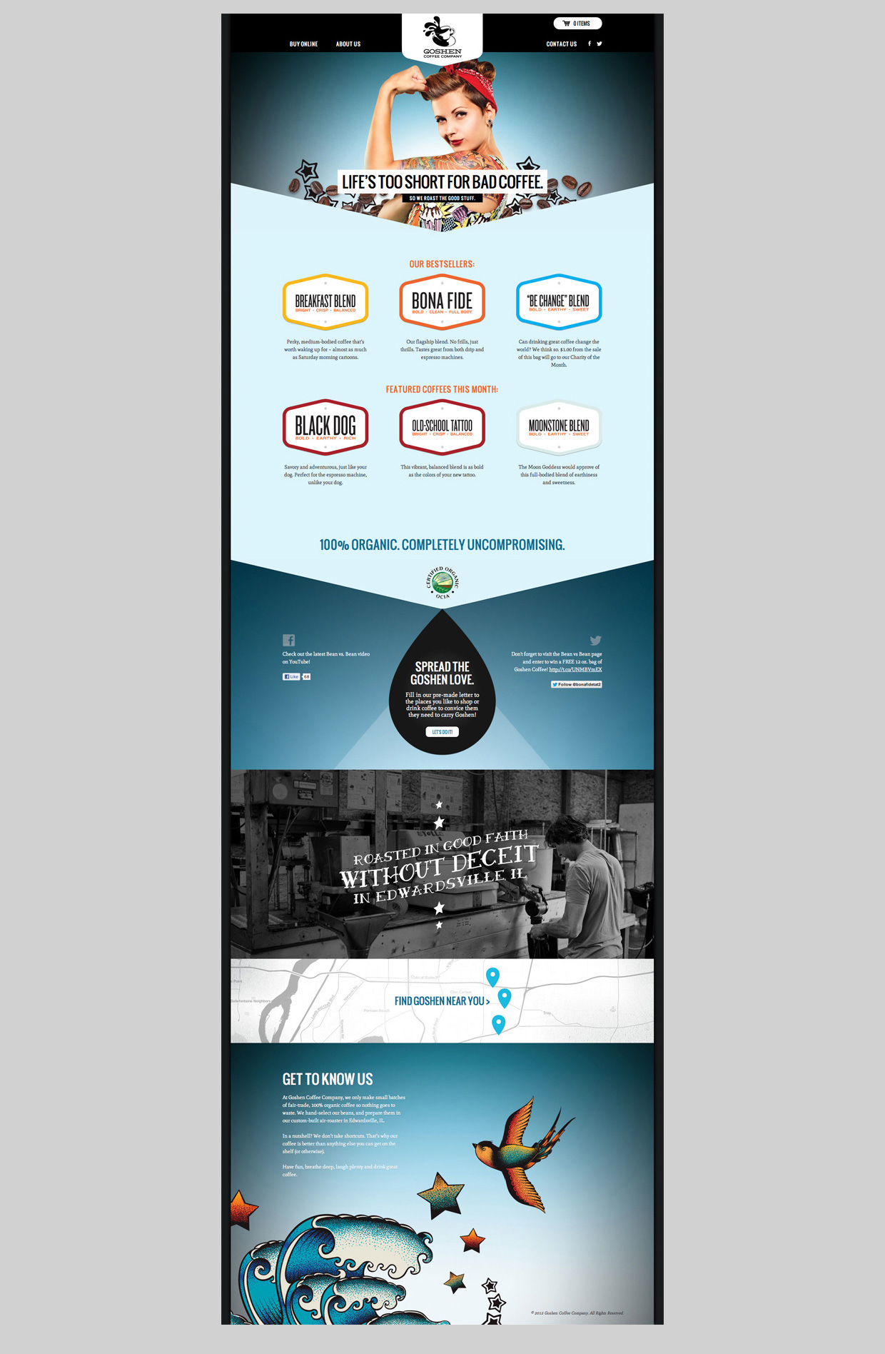
Packaging elements carried over to the website to stay true to Goshen’s identity. In addition to the glossy look and feel of the website, simplified navigation and a full-fledged online store help Goshen process orders with ease.
Coffee brands can come across as elitist, but Goshen’s all about honest coffee. The Goshen social media push showed that Goshen was as authentic as the coffee it produces. Part of this push was the Bean vs. Bean challenge, pitting Goshen coffee beans against an array of bean competitors in a biweekly Facebook taste test. Goshen always reigned supreme.
Goshen’s new packaging and website have been highlighted by various publications and design blogs, including Communication Arts, Food & Beverage Packaging, Identity Designed, Lovely Package, The Dieline, Chois Gallery, American Graphic Design, Paste Magazine and Web Design Ledger. The work has been honored in St. Louis at the Targeted Advertising and Marketing (TAM) Awards and AIGA Design Show 18, and received American Advertising Awards in both the St. Louis and district-wide competitions.
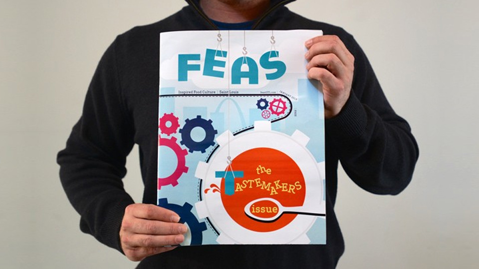
In 2012, FEAST Magazine named Atomicdust a St. Louis “Tastemaker,” thanks in part to our work with Goshen.
