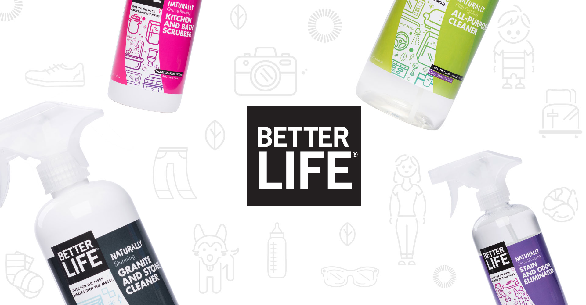
New Branding and Package Design for Better Life
Every small business owner dreams about it: a big break that puts their company on the path to becoming a household name.
Companies that find sudden success often find themselves forced to cater to a wider audience. They’re compelled to rethink their brand, adopt a sleeker look and voice, and ultimately smooth out all of their charming rough edges. All of which leads to a classic question: Can a company grow up without selling out?
That was the question facing Better Life, a St. Louis company known and loved for its natural, non-toxic, green cleaning products. In 2008, lifelong friends Tim Barklage and Kevin Tibbs realized that most of the “natural” cleaning products they brought into their homes either weren’t effective, or weren’t truly natural. They set out to create a line of products that were plant derived and safe for families, and Better Life was born.
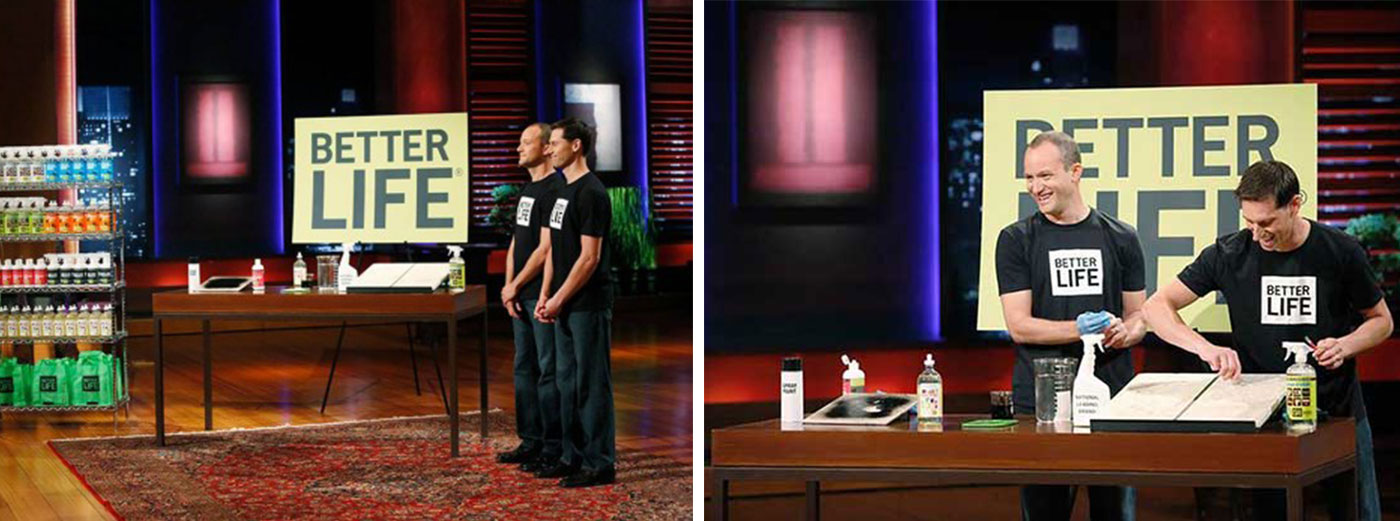
The company reached a turning point when Tim and Kevin appeared on ABC’s Shark Tank in November 2013. As the team pitched to the panel of investors, Kevin sprayed Better Life’s all-purpose cleaner into his mouth to prove its safety. The stunt paid off, sales exploded and Target and Walgreens came calling.
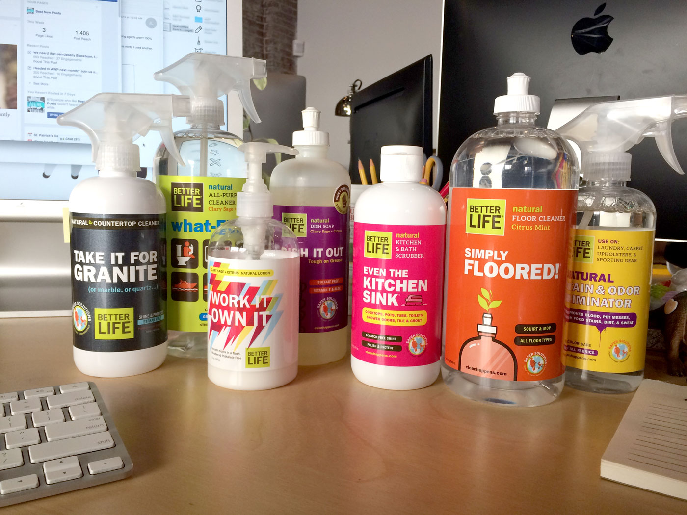
As the company grew to meet demand, Tim and Kevin realized that their brand – and their labels – were in need of some focus. Over the years, multiple label redesigns and new products had chipped away at any semblance of a cohesive brand. Better Life needed to evolve to meet the needs of new audiences, and to succeed on the shelves long after reruns of their Shark Tank episode had ended.
Because we’ve used Better Life products at the Atomicdust office for years, we were thrilled when the company hired us for guidance. After taking them through our branding program, we learned a few things:
First, customers agreed that Better Life was beating its competitors on performance and safety, but brand awareness was comparatively low.
Second, “natural” and “safe” were losing marketing impact as more competitors joined the space. To compete, the brand would have to promise something more unique.
Third, Better Life’s current packaging was eye-catching and fun, but disjointed. Design inconsistencies from product to product were causing confusion on the shelf.
To move the brand forward, we started by bringing focus to their story.
When people purchase green or natural cleaning products, they often believe they’re making an honorable sacrifice by swapping performance for safety. We knew Better Life could change that perception. We wanted people to know that Better Life’s products are just as powerful as the Cloroxes and Lysols of the world; they just happen to be natural.
With a direction established, we built on the positioning through design, starting with the labels.

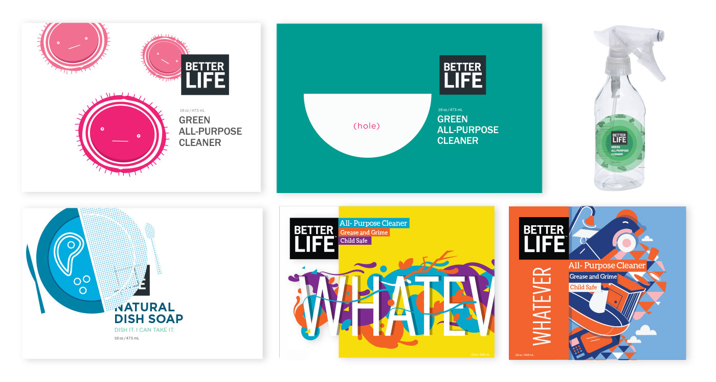
We resisted the urge to go high-end with elaborate die cuts, embossing, foil stamping or thin, elegant type. Better Life may be natural and plant derived, but it isn’t a boutique brand. And while it was created for people with children and pets, we didn’t think it needed to follow “family-friendly” tropes, either. Instead, in each of our initial designs, we focused on new ways to express the fun, quirky personality of the brand.
But as we worked through design concepts, we kept coming back to the same problem: the products’ names.
What’s in a Name?
Better Life told us in our very first meeting that their retailers felt the products’ signature names (what-EVER!, Automatic Magic, Oak-y Dokey and so on), were creating confusion on the shelf.
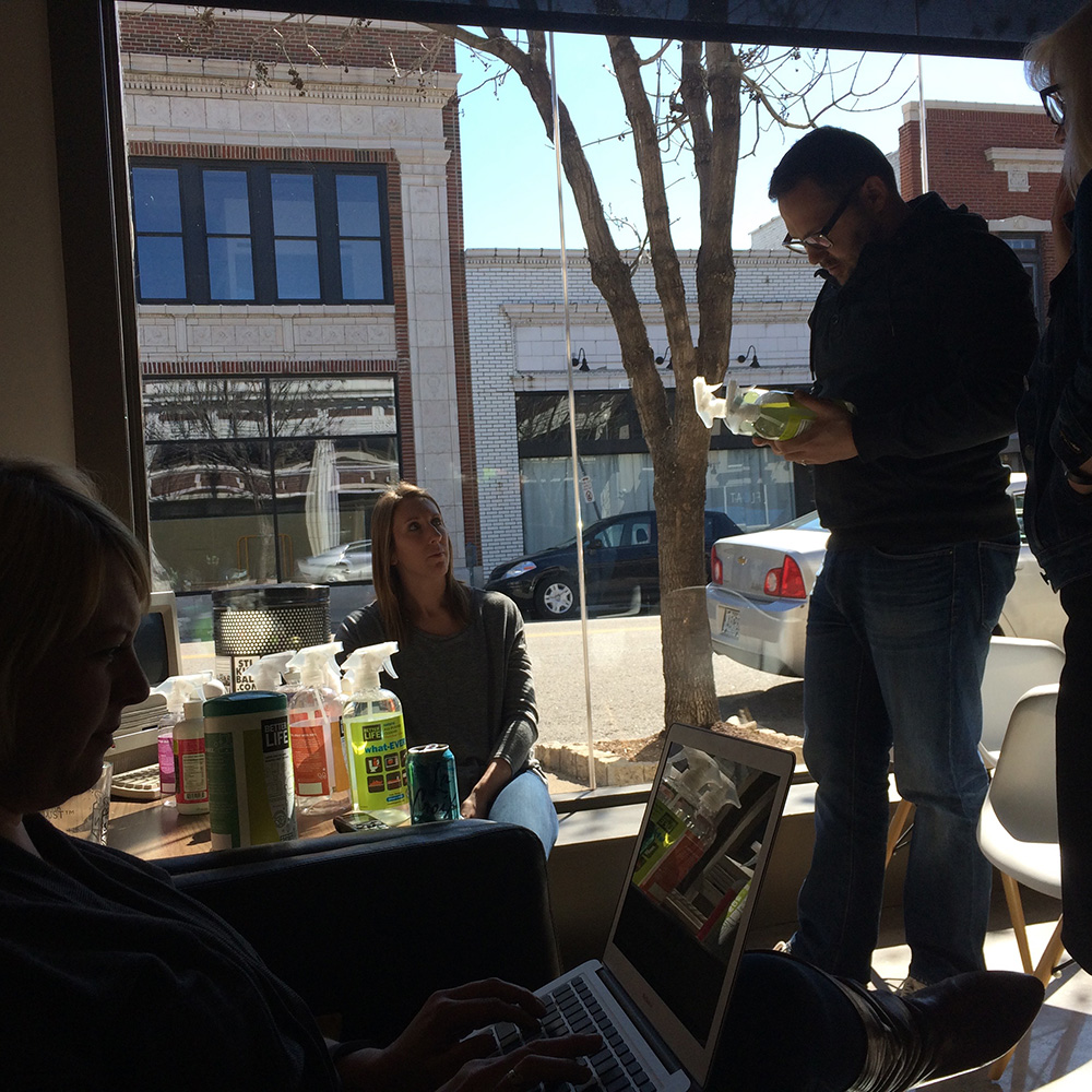
To informally test the retailers’ theory, we set bottles in front of our Atomicdust colleagues and gave them 20 seconds per product to identify the purpose. Note that 20 seconds is much more time than the average shopper would spend trying to figure this out.
The results were just what we expected. Several people thought “Automatic Magic,” a dishwasher gel, was a car cleaner. Others thought “Even the Kitchen Sink,” a kitchen and bath scrubber, was just for sinks. And while the “Oak-y Dokey” wood polish received several laughs, it received even more confused shrugs.
The answer seemed simple. We would replace the zany names with more descriptive titles like All-Purpose Cleaner, Dishwasher Gel and Wood Polish.
To be completely honest, this was a tough decision. Because we were Better Life fans ourselves, we felt protective of the brand. From the beginning, we aimed to enhance the look without throwing out everything that longtime fans loved. And fans loved the wacky names.
Better Life knew it. We knew it. But in the end, it was much more important to ensure Better Life’s message on the shelf was clear. We knew we could bring the brand’s persona through in new ways.
The back of the labels were much easier. Around here we like to use a famous Herbert A. Simon quote: “A wealth of information creates a poverty of attention.” The original Better Life labels were packed with information in tiny type. This made it hard for people to quickly understand what the products did and why they were the best choice. We found a clearer way to call out each product’s plant-derived cleaning agents, natural scents and list of “no”s – no bleach, no dyes, no synthetic fragrances, and so on.
Dozens of Designs and a Shortened Timeline
We developed nearly 50 different design directions ranging from strange to utilitarian. But we kept coming back to the same one:
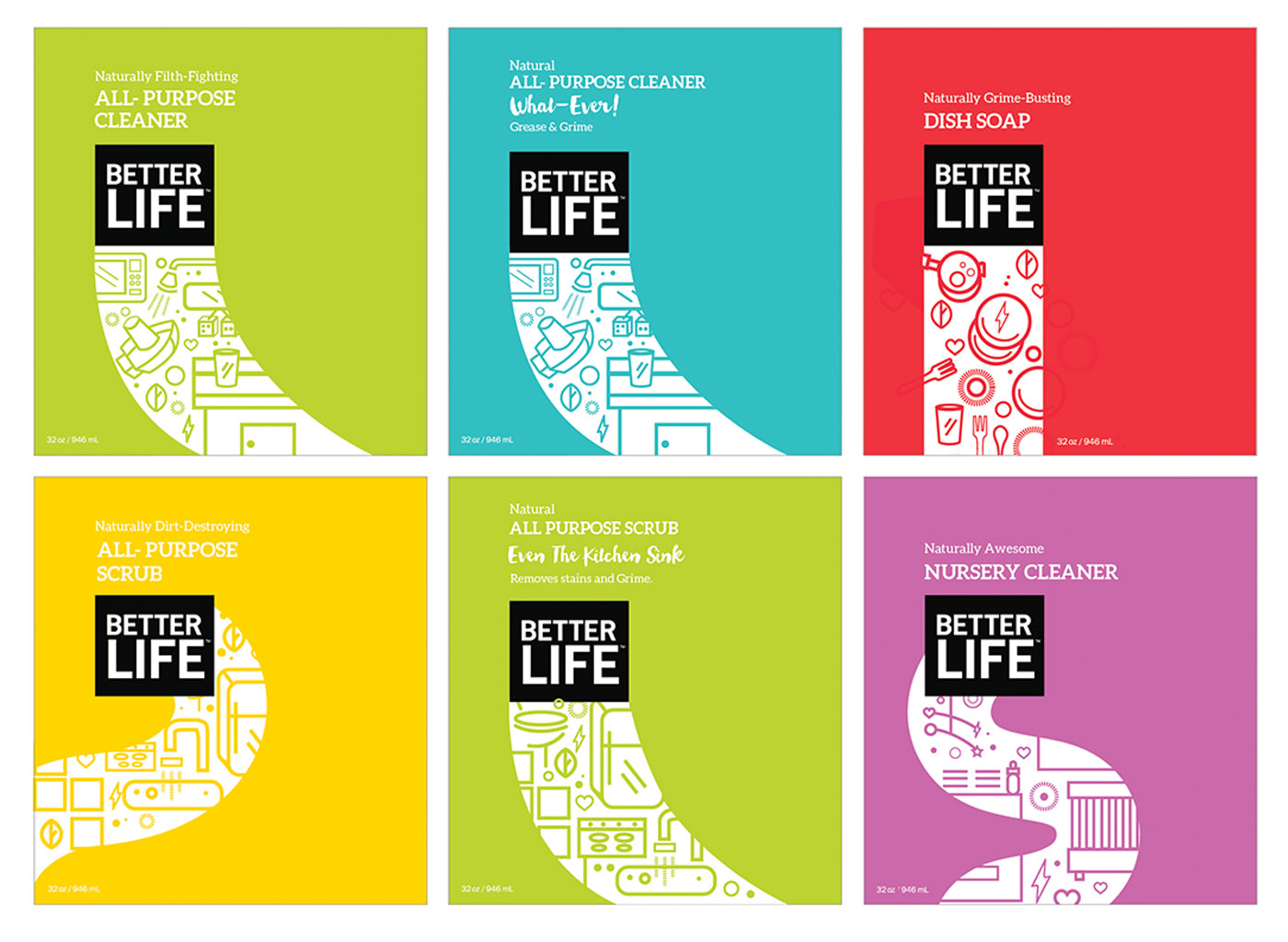
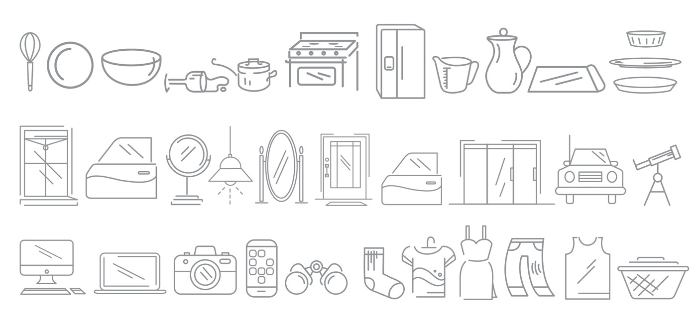
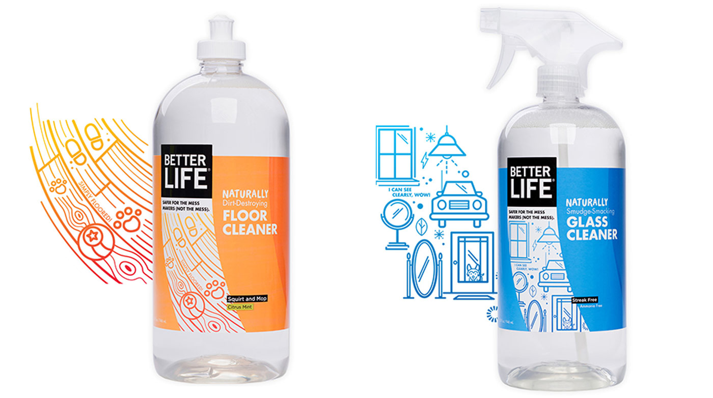
Transparency is important to Better Life. Our favorite concept took that idea literally, with a translucent swoosh that cut through the vibrant color of the label, mimicking the product’s power to cut through grime and dirt. Inside the swoosh, we placed amusing illustrations like smelly socks, an urn on a mantle, paw prints and rubber ducks to show the versatility of each product. Witty copy across the label established the friendly, quirky Better Life voice.
Throughout it all, we kept in mind that packaging transitions are always tricky. You can’t reach every fan to explain the changes, and old labels will inevitably end up sitting on the shelf with new ones, at least temporarily. To cut down on any additional confusion, we tried to keep the colors as consistent as possible from the old labels to the new: the All-Purpose Cleaner stayed green, the Kitchen and Bath Scrubber stayed pink, and so on.
During a check-in meeting to present our research findings and initial direction, the Better Life team loved our concept. They loved it so much that they asked to ramp up the timeline so they could debut the new look at 400 Target stores in July. We had three weeks to refine and finalize our designs and send them to the printer. We were intimidated, but determined.
Printing Problems
Anyone who works in packaging or product design will tell you that there’s a big difference between an idealized, flat concept and a final product. After fine-tuning the design for the initial seven Target products and finalizing the copy, we ran into a little problem: printing.
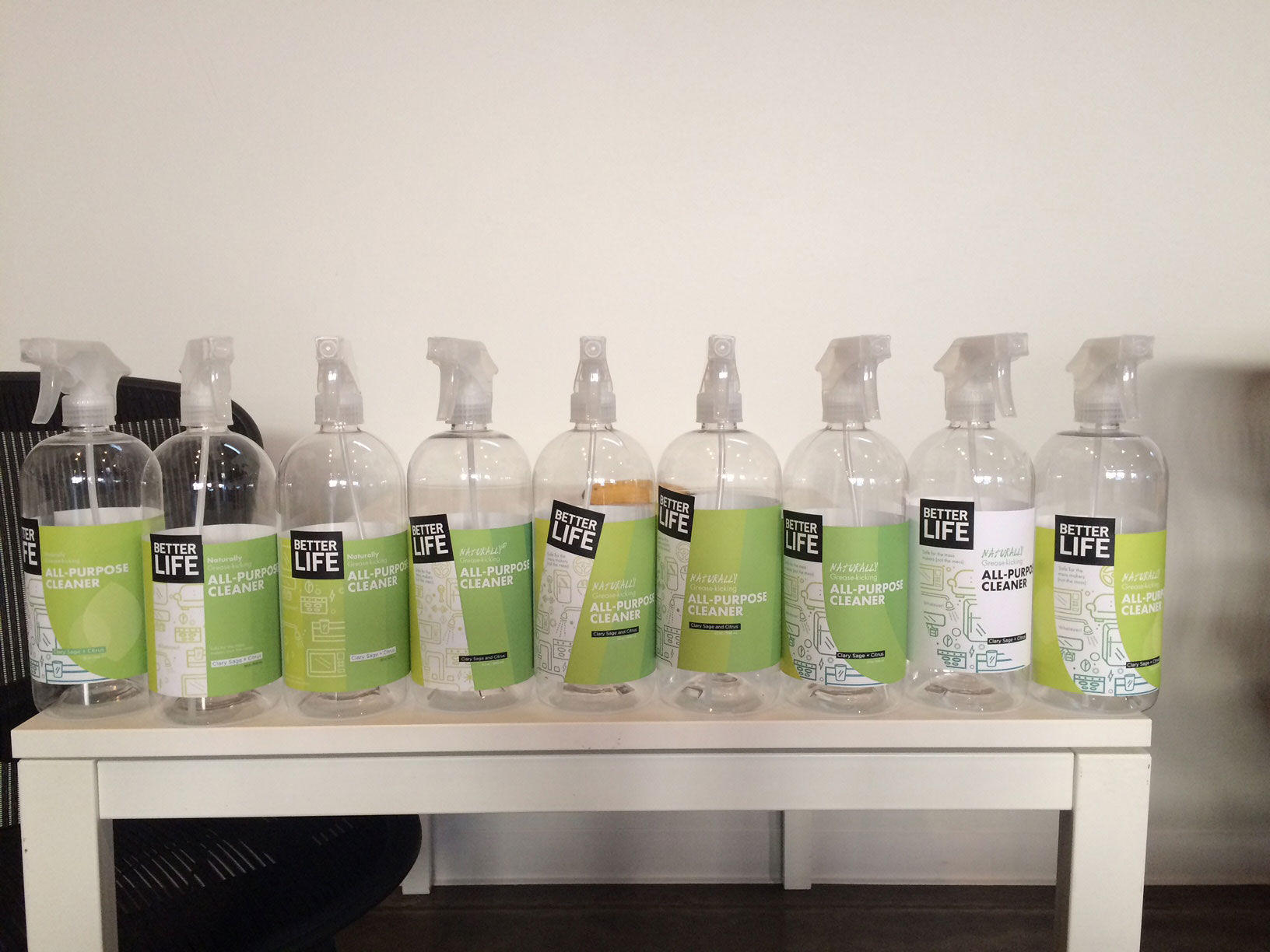
To achieve the clear swoop effect we loved so much, we needed to print the labels on transparent substrate. But using this kind of material meant we would have to build up enough white ink across the rest of the label to ensure the colors on top were vibrant enough. Unfortunately, after dozens of tries, we couldn’t get the color to the saturation level we needed.
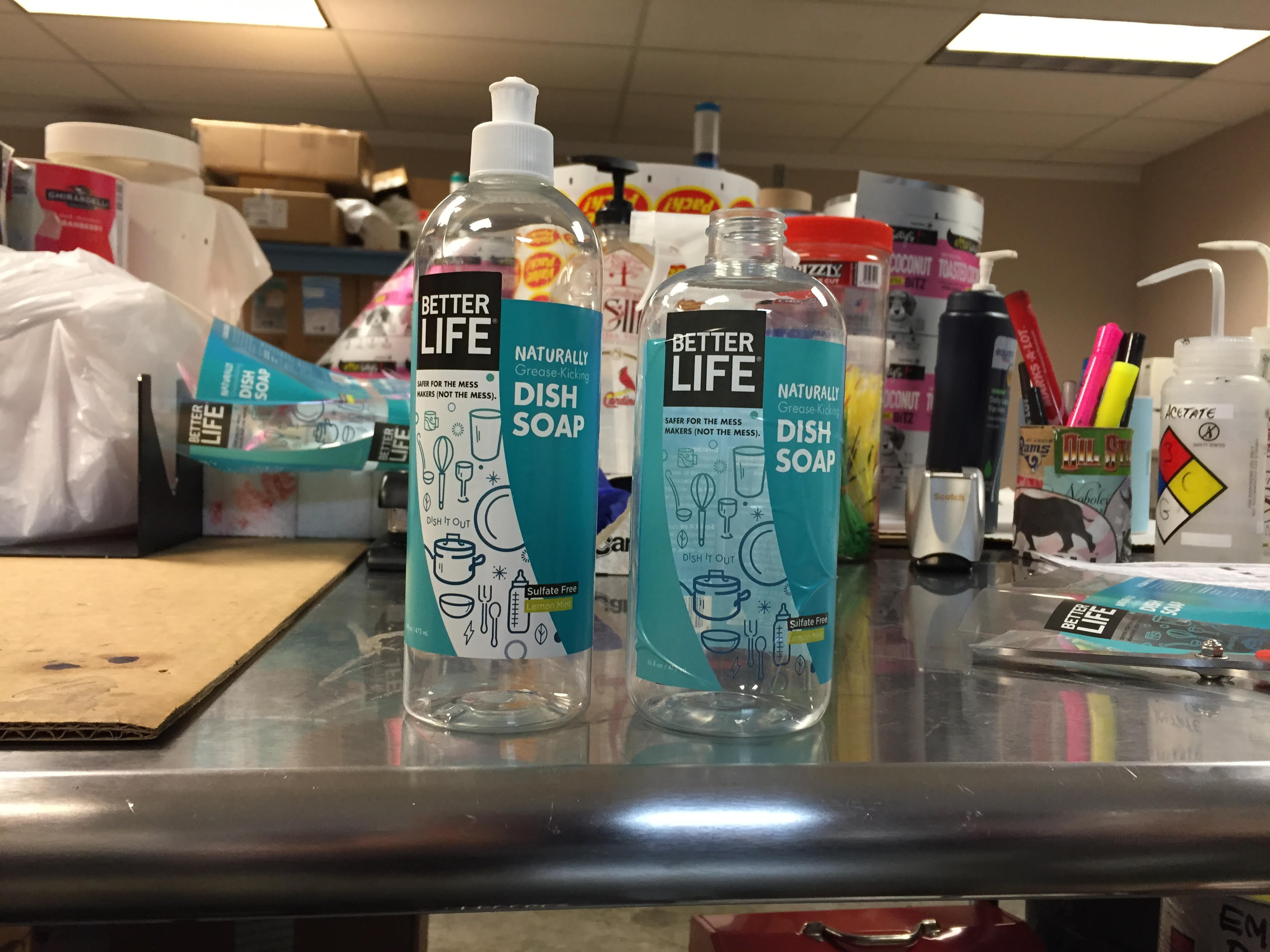
Time was ticking. Target needed the bottles. We had one day to decide how to move forward. Should we compromise, revise the design and start printing, or should we send Target the old labels until we could figure out the new ones?
On a whim, we tried printing the labels on white paper, effectively abandoning the transparent swoop idea. While this was disappointing in theory, in practice, we actually liked the new look better. The concept hadn’t changed, the white looked nice against the rest of the labels, and the illustrations popped.
It was a go. The machines started rolling, and the bottles were on their way.
Expanding the Line and the Look
As the first seven products made their way to Target stores, we began adapting the design to the rest of the product line.
Some decisions were easy. Unscented products should come in white!
Most decisions were hard. We realized early on that the swoop didn’t translate perfectly onto unusually shaped bottles or onto new products like the dryer sheets and cleaning wipes. Even as we made adjustments, surprising roadblocks popped up. The name “Dishwasher Gel” is too long for this design!
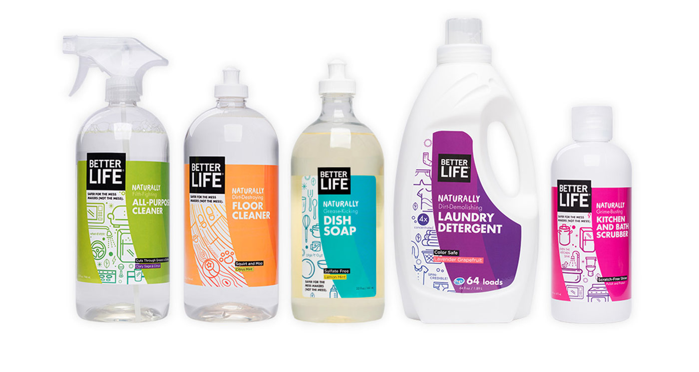
We made it work. The building blocks of our designs – the logo, the type, the vibrant colors, the illustrations and the swoosh – were recognizable enough that the adjustments didn’t break the system.
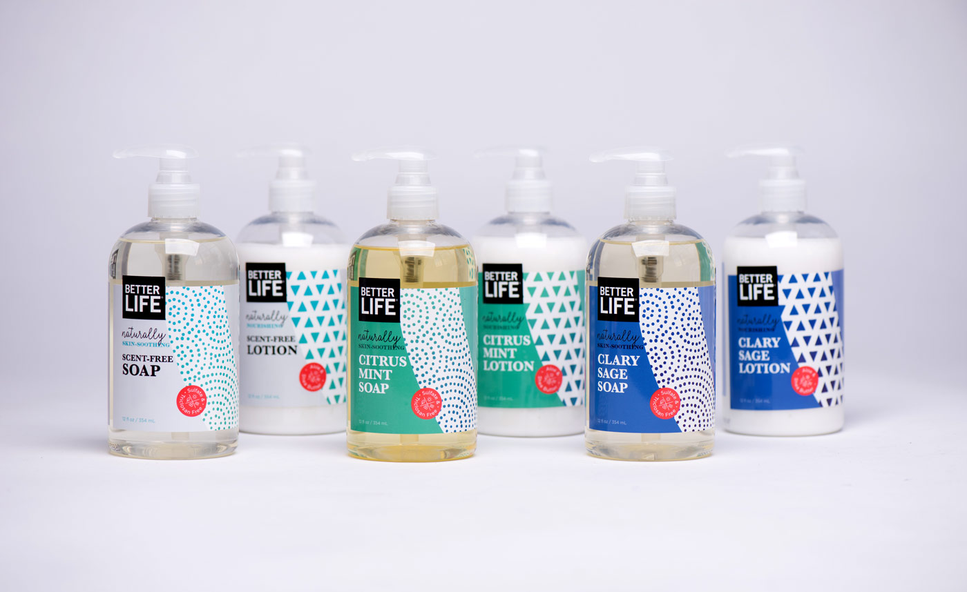
Then there were Better Life’s soaps and lotions, items that live in their own category: personal care. Using pastels, a serif font, and hand-drawn sketched patterns, we gave them a softer, gentler feel than the rest of the line, without bending the overall look too far.
Spreading the News
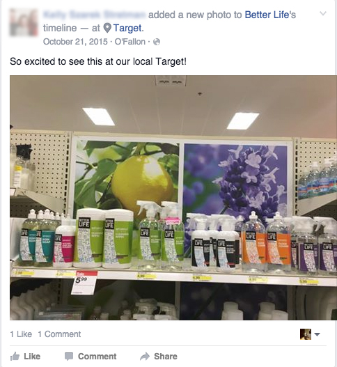
We planned to ease fans into the new look by slowly building excitement for the changes and, importantly, assuring them upfront that the formulas hadn’t changed. But the bottles started appearing on Target shelves faster than we’d anticipated. Whoops!
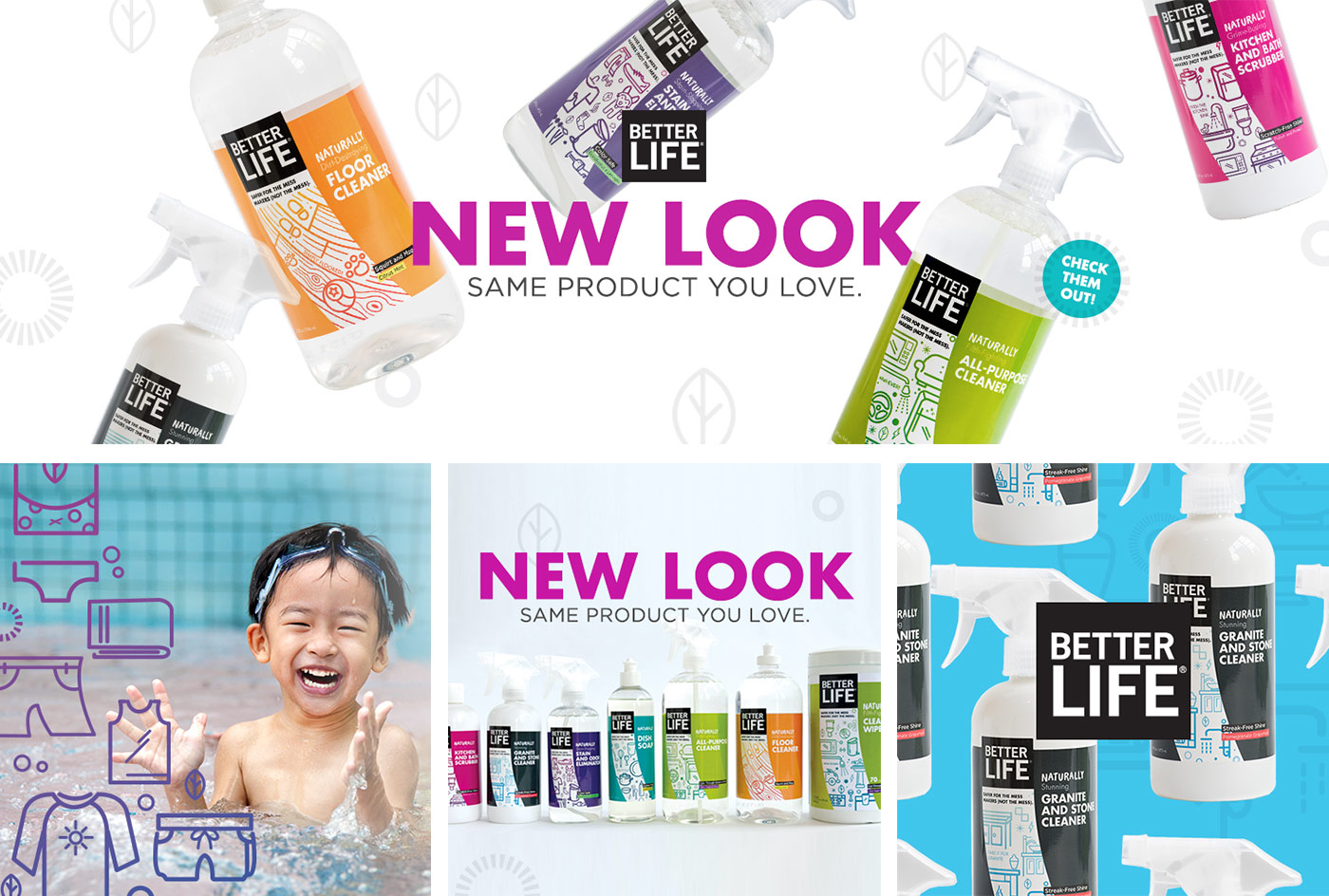
We moved up our communication schedule, and started explaining via email, social media, blog posts and postcards the exciting reasons for the changes: new stores, new products, and a continued commitment to bringing safe, natural cleaning to households everywhere.
As expected, some fans had strong reactions to the new names. We let them know they could find the old names in the swoosh, positioning them as a sort of “easter egg.” Thankfully, as word got out and new products arrived on shelves, these fans became more and more excited about the makeover.
The Heart of the Brand
So far, sales are strong, retailers are thrilled, and the response on social media has been promising. It’s still early, but the future is looking bright.
So, can a company grow up without selling out? Yes, but it isn’t easy. Change is inevitable, and you can’t please everyone. Throughout it all, we did our best to keep people in the loop, helping them feel like brand insiders. That kind of transparency was at the heart of the Better Life brand all along, and it always will be. By maintaining that, we kept the brand true to its roots.
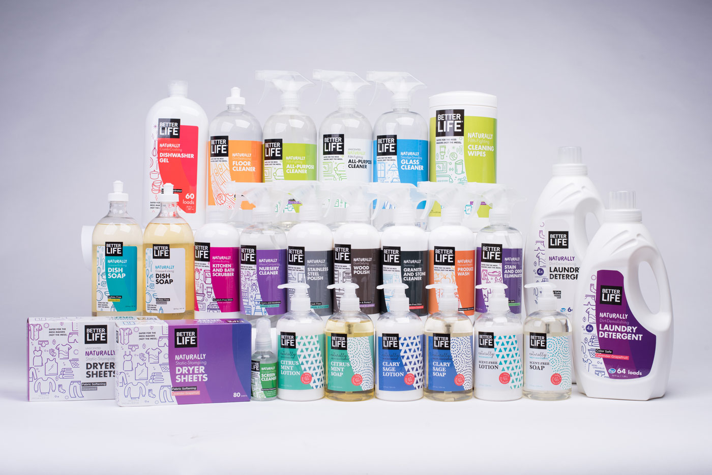
Speaking of transparency, we aren’t afraid to admit it: we were pretty excited to see our own work on shelves, not to mention on our very own kitchen sinks. We’re in love with the labels, and we aren’t alone; Graphic Design USA honored the labels with a Health + Wellness Design Award and a 2016 American Package Design Award. They were also recently featured on The Dieline and Packaging of the World.
Grab a bottle (or two!) at the brand’s new website now, or find a Better Life retailer near you.
